When I first restarted playing miniatures games “properly”, back in September 2013 with the advent of Kings of War, I decided to build two armies that could and would oppose one another, and ideally do them quickly. Those armies were Ogres, and Elves. The Elves would be a mixture of High Elf and Dark Elf and Wood Elf models, and as I built and painted more and more Elves across those three factions for the one force, they would all eventually split off and become their own armies. It seemed from JudgeDoug’s advice that the best list for me to use at that point were the Twilight Kin (Dark Elves). All that was fine, so I got started.
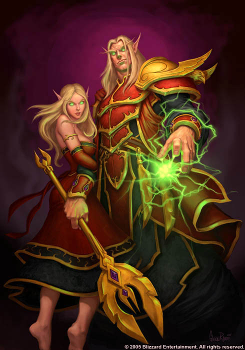
The thing was, I didn’t want my High Elves to look like everyone else’s High Elves. Silver armour with blue trim. It’s a good looking scheme, no doubt, but everyone’s models look like that! Instead, I took inspiration from World of Warcraft (which I was still playing at the time) and their High Elf offshoot, the Blood Elves. I’m not going to go into their convoluted background here, suffice it is to say that they look aesthetically pleasing and also different enough to the standard.
So I did that.
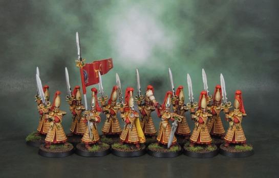
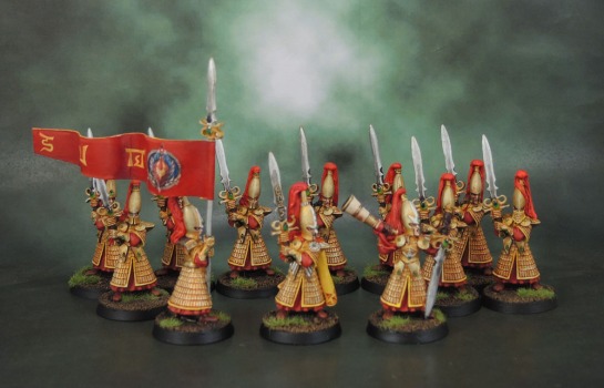
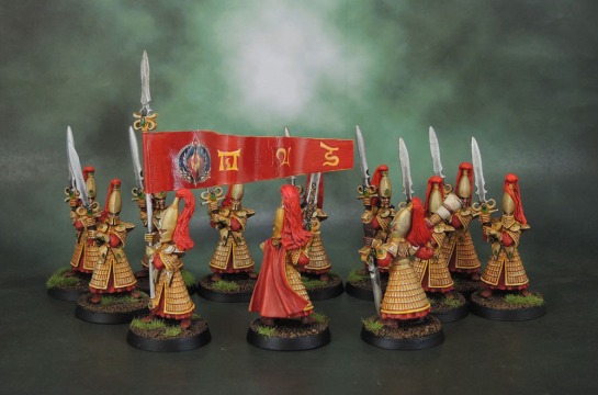
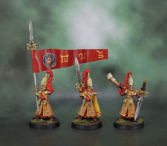
I actually smashed through most of the first unit fairly quickly, only stalling out when I got to the command group. I wanted to make the musician look cool, I wondered if I should do something special with the Champion’s cloak, and the standard bearer came with a banner pole that clearly was set up for a pennant-style banner. It’s taken me five years and this challenge to get me to finish them, and even then I tore the first attempt of the banner apart and off the model because it just didn’t work. Foil is fine for standards that hang down, but just does not work for pennants!
Since Elves are the finest craftspeople in all the lands in many of our games, I felt that my freehand would not do justice to the fine, fine detail that the pennant needed to be, so it took until recently when I got decal sheets working on my printer to a reasonable quality. And then I had to actually do it. To be blunt, I’m still not happy with the pennant. I feel that it should have a nicer trim, maybe some runes, and any.. OK. I just painted the runes on. Because this figure has been one of the least pleasant models I’ve ever worked on, and I need(ed) to get it to a point where I can look at it and not hate it. Push on through the “wall”, so to speak.
So now I’m okay with the standard/pennant bearer. As in, I don’t (well, won’t) immediately aggro up when I see the model (well, give it a week to get to that point). It did take adding the freehand runes tonight to it to get it to that point that I can bear to look at it, but since it was (briefly) finished in time, I’m still going to call it a June-Unit. The three Warhammer-Elven runes, from left-right are Asur, Oriour and Sarathai, so sort-of translate as The Eternal Flame, Blood and Birth, and the World Dragon, fitting in with the Blood Elf racial themes. And also looking alright. I’m still not super-pleased with it, since it should have some edging and trim, but the Blood Elven winged shield didn’t leave much (any) room for edging, and it was all made more complicated by the pennant shape needing to be cut to shape after being glued onto the model.
The models here are the 1998 Swordmasters, which replaced the formerly-Marauder Miniatures sculpts from 1991-2. Gary Morley gets a lot of (well-deserved) shit for Nagash (despite the story behind it, see below) and some of the other ham-handed sculpts that he turned out over the years, but this range of High Elves that he worked on are quality figures.
Anyway, this is the last of my June-It units to show. The next three posts will be my personal monthly round-up, my own June-It Round-Up, and the Community June-It Round-Up. Apologies to all involved that it’s taken so long, but RL has been pretty full-on this last week and kept pushing me back as what I need to get done has taken longer to do than I’d have liked (and turned out to be more work to boot!)
The Nagash Story:
The webpage I first read about it has been lost to time, but I found a transcript buried in a forum thread about unrelated models, so copypasta time! This is quoted as being Gary’s own words. Obviously I have no way to confirm this 100%, but here it is…
…. the story on the Nagash, model… is this;
It was my first big Multi-part mini I had ever attempted. and it certainly
went through many versions in sculpting. (In those days concept drawing
were very sketchy and I had very little input.) But only one version ever made it to the
moulds. However, there are two head versions the original head was based
on the design that i was given, a more Zombie looking type. And that was the one
that my design manager and I (at the time) prefered. But at that time all miniatures
had to be approved not only by the design studio, but also by the sales management.
This is where it came un-stuck! They did’nt like it, and prefered to have a Skull,…?
Much to my dislike. Now because of release dates and schedules I had one day to put it ‘right’. So preffering the original I went ahead and made the alternative. Now, I never thought for one moment thought that they would approve the (laughing clown) skull and would revert back to the original.
The Joke back-fired. And to my horror it was approved and they released it!
Throughout my time at GW I know i made some sculpts that I was not that happy with.
But, Nagash has been the one model that Haunted me all through my time there.
(AND IT STILL DOES!)
And vowed that I would re-make before I left. However, that was never to be.
I am working on my own version but will prolly not see the light of day until next year. Stands approx 70mm tall and will be cast in around 20 parts.
Blood Bowl was my favorite game at GW. Shame they never wanted to push it further. I would have love to have seen a Necromunder version.
Well, the colours work for me and that’s a damn fine standard!
LikeLiked by 1 person
Thanks, the Gold and Red do work well together. And I finally got the standard to a point where I no longer hate it with the freehand runes. So that’s a good thing at least!
LikeLiked by 1 person
I bought a Reaper Elf which has images online of it being silver and blue, looked very nice but hadn’t appreciated it was such a common finish. Given your comments I might have to rethink the colour scheme. Very nice figures once again.
LikeLiked by 1 person
Hey! Don’t be put off my my comments there – it’s a classic scheme, and is so for a reason. I was in a situation of being about to paint an entire army of the things, so for that reason I went very different.
LikeLiked by 1 person
Azazel… You have been utterly banging these things out, its unreal. Im already panicking about my over ambitious Jewel of July entry! These liok great an may even be a step towards me no longer hating the high elves (a grudge ive held for nearly 25 years… But thats another story).
Hey, so you have Wood Elves? You know, i have a unit of woofef archers i think from about 5 years ago. Myself and my friends were going to get into fantasy but they didnt bother after i bought a unit of ogres and a unit of wood elves. The ogres got painted so i sold them with the rulebook, but these archers… I never thought they would sell for much so i never bothered. Would you like them? Free to a good home?
LikeLiked by 1 person
Thanks mate, you’re very kind. The only ones of this unit I finished this
last month were the 3 command models – it’s just that they complete the unit, so it’s now a unit that was finished in June!
I do have Wood elves, and that’s very kind of you to offer. I’m in Australia though, so the postage might be a bit excessive, depending on where you’re located?
LikeLike
UK, ill do a bit more more research but i think it will be about £5
LikeLiked by 1 person
Well, that’s completely useful, me getting back to this post and seeing the comment, what? 3 years later. DERP!
Sorry about that….
LikeLike
The gold and red on the High Elves look even better than the standard silver and blue.
LikeLiked by 1 person
Thanks Thomas. I still really like the silver and blue look (I”m sure I’ll use it on something myself down the line!) but these ones stand out a bit more because of the difference.
LikeLiked by 1 person
Very nice, that colour scheme really works well for High Elves (much nicer than blue and silver I feel). Well done sticking it out with the banner, I’ve been there with banners that didn’t turn out as I wanted them and I know the aggro well (a bad banner can spoil a whole unit but damn they can be aggravating to paint when your imagination conjures beauty and your brushes fail to follow suit!). It may have taken a while but your effort has definitely paid off here though/
What is the story behind Nagash which you allude to by the way? I always thought it was just a duff model that was replaced by a much bigger duff model that I don’t really like but pretty much everyone else loves but I’m sensing there’s more to it than that?
LikeLiked by 2 people
I (finally) found the Nagash Story and incorporated it into the end of the post proper, above.
The banner issue wasn’t even the painting, but the physical form of it being a difficult nightmare to set up and get onto the model in a stable way (and then get paint onto). Adding those runes and them looking decent was honestly the thing that saved it from learning to fly and saved a wall from getting an imprint.
LikeLiked by 1 person
I’m not an elves kind of guy, apart from dark eldar, but these are eye catching for sure. They look much better than the silver/blue of the norm. Well done on getting them finished.
LikeLiked by 1 person
Thanks IRO. The classic look is still that, but yeah, these ones do catch the eye due to their difference.
LikeLiked by 1 person
The gold and red looks fantastic. The silver/white/blue is classic for a reason, but you’re right, it has become overused. This is another that not only looks good in and of itself, but still seems iconically High Elf.
The male High Elves that Morley did are good, but his sculpt of the Everqueen was just hideous. I still feel he did best with monsters.
Finally, a joke: During the End Times, why did Teclis side with Tyrion against the other Loremasters?
LikeLiked by 1 person
Thank you, Alexis. it’s just those decades of repetition. Silver/Blue High Elves, Purple/Black Dark Elves, and so on it goes. They look good, but they’re so much the default colours that it makes things kinda tedious.
Having said that, I’m still strongly leaning towards Gold/Blue Stormcast and Gold/Red Custodes, so I’m almost (just) as vulnerable to the “like the ones on the box”-isms as anyone else. Yeah, Ariel wasn’t the best model. I think I have here here somewhere. I can’t think of which monsters he did offhand, though I can think of way too many of Trish’s ones. (flat, smooth, untextured skin and then one dozen GIANT scales).
The Joke… uh….?
LikeLike
Oh man, so Purple/Black Dark Elves has always been a thing?! Crap, that was what I was thinking of going with for me Delf Blood Bowl team. It looks so good on them though!
LikeLiked by 1 person
Yeah, I had issues with Night Lords for that reason for ages because GW used them for all the CSM box art in 2nd Ed. And I know there are people who feel the same about Ultramarines.
I can’t recall which monsters specifically, I just remember a feeling of “Wow, Morley does cool monsters”. Some of the Minotaurs, maybe?
As for the joke, well, it’s a classic rule: Bro-eth before Hoeth 😀
LikeLiked by 1 person
Yeah, Purple-black DE was their go-to scheme for …as long as I can really remember. It does look good on them for sure, though!
LikeLike
….groan.
Morley’s not actually a bad sculptor, and hopefully by now most people know the “real” Nagash story. I still haven’t trracked down his monsters, but they stopped crediting the individual sculptors in later catalogues before stopping the catalogues entirely. Stops the sculptors taking their followings elsewhere would have to be the rationale for that, I guess…
LikeLike
Really nice colour scheme, that! Remind me of Adeptus Custodes – and to be fair, Swordmasters aren’t far off.
LikeLiked by 1 person
Thanks and yeah – I didn’t consider that before. I’m going to have a lot of gold armies eventually..
LikeLike
Cool! I’m glad you credited Morley, because I didn’t realise that he did these guys – he was actually pretty good (despite some absolute howlers of course 😉
I’m digging the colour scheme on these mate, gold & red suits them very well. I think I can see why that pennant is bothering you so much though – all the other ‘soft’ materials are hanging down as if it is a still day, (plumes, cloaks, etc.), but the pennant is a bit over-jaunty. Is the material flexible enough to bend it & let it hang down naturally? This should make for some really nice folds & add interest. Also I have seen some good examples where the end of a pennant is finely sliced & painted gold to represent braid… might be worth a try?
LikeLiked by 1 person
The issue is pretty much the fact that it’s a pennant pole rather than a banner pole, on a bendy spear, with a huge high elf helm in the way of anything you try to do. A sculpted pennant would have been easy to sort out.
The original Pennant (of mine) was made of wine foil, but it’s just not the material for pennants and is too likely to tear, as I found out. This one is paper, and holds up okay, and if I were to touch it again, it’d probably be to set the thing on fire, so I’m probably going to leave it now. Though slicing the end of it up is a little bit tempting…
LikeLiked by 1 person
Very nice work. I really like these old Morley sculpts.. he did much fine work at GW on the High Elves range, as well as Necromunda and Blood Bowl. I must say though red and gold is surely the 2nd most common colour scheme for High Elves? lol. Great work anyhow and the banner looks pretty good to me 🙂
LikeLiked by 1 person
I honestly have never seen high elves in gold and red. Silver and blue, silver and teal, silver and green, silver and seagreen. Even silver and purple; but never gold and red. Neither in person or even online.
LikeLiked by 2 people
I haven’t seen it either. At least nothing close to your colors.
caseyrog has been working on these: https://wyrdstonesandtacklezones.com/2018/03/03/under-the-brush-tinkering-with-elves/
And someone did a Blood Bowl High Elf team in gold. Super nice looking, but no red: https://bbtactics.com/forum/threads/high-elf-team.1490/
I’d say your Elves are pretty damn unique! 🙂
LikeLiked by 1 person
I’m sure they’re not entirely unique, but being quite different to standard is good enough for me!
Those guys have done some nice work there, as well!
LikeLiked by 1 person
Interesting… I have seen Gold and White, Gold and Red, Red Gold and White… not heaps (compared to the classic scheme) but enough. Yours look great anyway; looking forward to more.
LikeLiked by 1 person
Well, I never assumed that my scheme was 100% unique or anything – (let’s face it, that’s next to impossible) – just far enough away from the standard schemes of Silver and Blue&White/Silver and whatever… 🙂
LikeLiked by 1 person
I didn’t mean anything by it, they look great, and I’m looking forward to more of what will indeed be a pretty unique army by the time it’s all done 🙂
LikeLiked by 1 person
No we’re cool. I was just “really? I haven’t seen the scheme before.” I googled it a couple of days ago and saw a couple that were pretty similar in the end anyway. 🤔😀👍
LikeLiked by 1 person
Those came out really nice looking, and great call on the color scheme. Sorry to hear about the woes with the banner. It looks pretty nice, and hopefully someday it won’t sting so much.
I think the Blood Bowl High Elf team was the first one I ever finished painting. They have a similar scaled armor, and I really didn’t know how to go about it at all. My brush control was nowhere near where it needed to be, and so things were sloppy. I always wondered if there was some trick to it, other than painting every scale individually. I guess you could apply a base color, apply a very careful thin wash or two, then hit the edges with some highlight. Just don’t think there is a super fast way to paint all those scales though. On the plus side, they look really cool if they are tidily done.
LikeLiked by 1 person
Washes and very light drybrushing are your friends here. Easiest to keep it out of the gaps if you can do the drybrushing with a brush that has fairly long bristles, and use a motion diagonal to the scales.
LikeLiked by 2 people
I’m not sure what I tried, and I don’t have those minis any longer. I might have some photos somewhere though. I’m pretty sure straight inks were involved as a wash at one point. Which really makes me cringe, just thinking about it. I’ve also never been too patient with dry brushing. The more I think about it, the less I want to see those old minis. Haha!
LikeLiked by 1 person
I can totally understand that. There are some Ral Partha Kobolds I painted when I was like 9 that I’m really happy are gone, probably at the bottom of a landfill somewhere.
Drybrushing (and the related overbrushing) have long been staples of my painting method. Some of my dudes have been almost entirely done just with drybrushing, maybe a wash, and then picking out a few details.
LikeLiked by 2 people
I always end up overbrushing, haha. Oh yea, my first Grenadier Gargoyle painted in glossy enamels, with black lines for muscle definition … hopefully ended up a pile of molten lead. Those Ral Partha Kobolds were pretty sweet. I think my brother had some, that will show up in Old Mini Monday.
LikeLiked by 1 person
I might fray the end as Alex’s suggestion. Past that, I won’t touch it again and eventually it’ll be fine as just another painted thing – and of course it’ll look just fine at a distance and on the tabletop. I find that once a model is complete and off my table, any animosity that it’s created by being a pain in the arse to paint diminishes quite rapidly.
Alexis has it here as far as the technique goes – washes and light drybrushing is what I use for scale, and what I used on these guys as well. You *could* paint each scale individually, but to me that’s way too time-consuming on anything but an absolute showpiece model.
LikeLiked by 1 person
Great work- nice and clean looking.
Cheers,
Pete.
LikeLiked by 1 person
Thank you, Pete!
LikeLiked by 1 person
That warm colour scheme looks good. Morley seems to get a lot of stick as a sculptor but I love a lot of his miniatures.
LikeLiked by 1 person
Yeah, his reputation suffered disproportionately from Nagash. Some of his minis are nothing special or a bit chunky, but he also turned out a lot of bloody solid models as well as some classics.
LikeLiked by 1 person
I really like these. You’ve managed to keep the scheme looking very elven even though it totally eschews the standard silver, white and gold.
LikeLiked by 1 person
Thank you – though it’s pretty much just nicked from WoW anyway – and as much as they ripped off GW for many of their designs (not like GW themselves would do such a thing!), Blizz still has (had) a lot of quality designers amongst them. Including people like Mark Gibbons for a good time…
LikeLike
Hey there. Sorry for necro posting, but I just stumbled upon this nice paint scheme of yours. What colors did you use for the helmets here, and what techniques? Looks really awesome and I think I want to do an army inspired by it! Cheers
LikeLiked by 1 person
No worries and apologies for the late reply – I didn’t really post for a month until a few days ago. I used a custom spray based on Citadel’s Retributor Gold, gave them a wash of (I believe) Citadel’s Reikland Fleshshade Gloss, and then a fine drybrush of Vallejo Model Air Gold 71.066. The red topknots/tassels were done with Mephiston Red highlighted with Evil Sunz Scarlet and a final (top) highlight of Astorath Red (hydrated a little into regular paint) – then hit with Agrax Earthshade Gloss.
LikeLike
Srry for necroposting. I just stumbled upon your awesome paint scheme here. What colors did you use for the helmets, any special techniques? Cheers!
LikeLiked by 1 person
No worries and apologies for the late reply – I didn’t really post for a month until a few days ago. I used a custom spray based on Citadel’s Retributor Gold, gave them a wash of (I believe) Citadel’s Reikland Fleshshade Gloss, and then a fine drybrush of Vallejo Model Air Gold 71.066. The red topknots/tassels were done with Mephiston Red highlighted with Evil Sunz Scarlet and a final (top) highlight of Astorath Red (hydrated a little into regular paint) – then hit with Agrax Earthshade Gloss.
LikeLike
Hi again. I can’t for the love of god reproduce the look on those helmets! They look almost white-silverish with just a glaze of gold. I can’t get the look with the colors you mentioned. Are you sure those are what you used? Whe’re talking about the gold effect on the helmets.
LikeLike