
Another model from my big shipper box of Shadows of Brimstone sprues today. It’s the Swamp Raptor of Jargono!

Like pretty much all of the Brimstone Models I’ve worked with to this point, it’s a pretty simple model, all in all – though not a bad one.
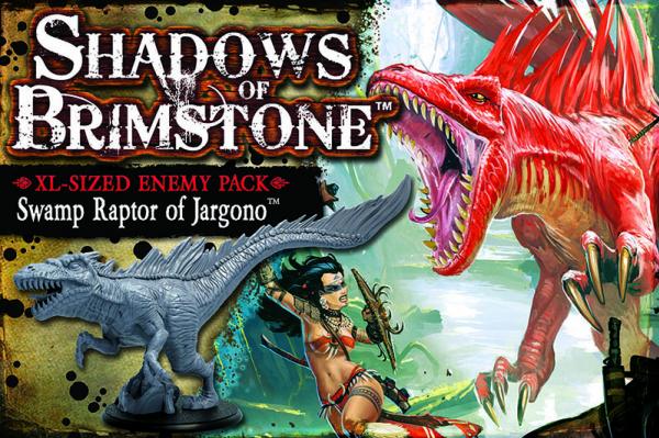
The Swamp Raptor box doesn’t come with an included Barbarian Bikini Babe. At least to my knowledge. I’m pretty sure she’s not even a playable character, NPC or even enemy type in the game, so I dunno what Flying Frog were thinking there?
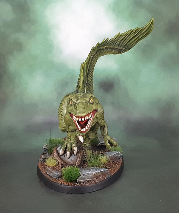
Given that the model is supposed to be a Swamp Raptor, I also ignored the colourful rendition on the box art and went instead for a darker green look. Trying to straddle that line between overly-realistic dullness and bright enough to be interesting tabletop miniature. I also swapped out the pitifully small, round Flying Frog base for a larger oval that fits the model much more nicelty, while allowing some space for rocks and some foliage.
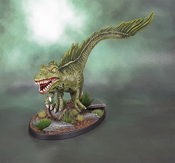
To this end, I incorporated some striping, though the washes, highlighting and shading makes the striping blend in much more than originally envisioned.

The tonal variation on the teeth is there, they just didn’t come out in the photograph. You can kinda see it in the claws at least, though again, nicer in real life. I really need to get better at photography, though it’s a little trickier with larger models like this – and of course, what looks fine onscreen can look less fine on the PC, later.

I added some yellow to the dorsal crest and the tail. Again, trying to straddle that like between ambush predator and way too colourful. A yellow glaze and some yellow into the green highlights brightened the crest up a little without going fully neon.

Scale shot! Dwarf Slayers attack the Raptor, seeking a Mighty Doom!

Very nice mate and I like the large base too. The stripping in particular stands out for me.
LikeLiked by 2 people
Thank you. The smaller base is that it comes with is obviously only because of the few standard base sizes that the game uses, but the large oval fits the figure so much more nicely without affecting the gameplay (from what can tell, anyway!)
LikeLiked by 3 people
Basing size is so overrated!
LikeLiked by 1 person
My preference is whatever fits best, aesthetically.
LikeLiked by 1 person
Excellent work mate, I love that it looks deceptively plain at first, but then rewards a closer look with those lovely stripes and crest highlighting – a tricky balance to get right! Bravo 🙂
LikeLiked by 2 people
Thanks Alex. It was one of those models that wasn’t a ton of fun to paint, so even though it didn’t all work out to plan, I’m ok with it as a finished piece in the end.
LikeLiked by 2 people
Looks like a ton of fun to play with though! Raaargh!!! (stomp, stomp, stomp… etc)
LikeLiked by 1 person
I’m going to have to paint some of the core set and PC models for Shadows of Brimstone sometime. Then maybe we can start on reading the rules and perhaps even play a game one day…
LikeLiked by 1 person
Nice one, mate! The subtle details are fantastic, like the strips.
Personally, I rarely check my blog on a big desktop screen but every time I do I’m struck by how different all the pictures look compared to the iPhone. It can be a bit demoralising at times.
LikeLiked by 2 people
Thanks Thomas! And yeah, I feel like I need to do something about my photography. I’ve been using my new phone lately, and it does some stuff better than my camera, but my camera does other things better than my phone. I just want something that does it all!
LikeLiked by 1 person
Grawr! Always a fan of dinos, and this is a good one! Nice job balancing between naturalistic and bright enough to have some interest. The larger base really helps, too. I might have gone for a bit of counter-shading, lightening up the underside, but even without that, it looks great!
LikeLiked by 3 people
Actually I did. If you look carefully, you’ll see that the underside is a different/lighter shade of green to the “main” body. Remember when I said that the washes and shading took away a lot of the original contrast? Yeap… it’s happened there too.
The main body also appears a bit lighter in the photos due to the satin finish and all of those textured ridges picking up the lights.
I went for a lighter underbody, but also a low contrast to the main body as I was trying for more naturalistic than a typical “Warhammer” model, and wanting to avoid going yellowish there, or even ochre/tan, instead keeping it green.
So yep – great suggestion and it’s actually in there – just the shading and the satin+lights+photos do a great job of camouflaging it! 😦
(It worked out much more effective on the Sand Crabs)
LikeLiked by 1 person
Ha! You’re way ahead of me. And honestly, now I think of it, the lighting really should kind of wash out that difference. That’s the whole reason animals tend to be countershaded, so they don’t stand out so much from the sun making them brighter on top. So, yeah, tack another “Well done!” on there 😀
LikeLiked by 1 person
Nah, it should still be more obvious, though not necessarily as obvious as on a Warhammer Lizardman/Seraphon. No shame in admitting that the paint didn’t turn out as well as I’d envisioned/hoped, and that the photography also took the final appearance (for you guys at least) down another couple of notches. Not everything can be our best work, after all.
As I recall, I first learned about (or properly thought about) how natural countershading works after watching some goats on a hill in New Zealand in 1998/9 or therabouts. Looked it up in more detail after that. Wish I had gotten a photo of those goats, now.
LikeLike
Very nice! I think your take on the colour scheme looks a lot better than the box art and the shape of the base fits nicely with the overall dynamic of the mini! Cripes, I’m starting to sound a bit waffly, should just have left it at “very nice”!
LikeLiked by 1 person
Thanks, though to be fair, the bar is pretty low with that box art and the widdle tiny base it comes with.. 😉
LikeLiked by 1 person
Hard to believe that was once a boring piece of plastic. I also am constantly amazed at how well you paint animals. Your contrasts and highlighting and little details really bring this to life. I would have tried a yellow underbelly, just because I don’t think I would have been confident about getting the right amount of contrast between the underside and the rest of the model. But you pulled it off fantastically. Good call, and I can’t imagine it painted any better. Also those Troll Slayers are pretty sweet.
I think your next (personal) challenge should be “Paint a Crappy Miniature”. Then all of us mere humans won’t look so bad! 😉
LikeLiked by 2 people
Animals are pretty simple in a lot of ways – (mostly) muted colours, (usually) reference from google image search, lighter underbody, darker spine, google the proper look for the muzzles and eye colours. Don’t be afraid of some uneven mottling, as not being completely symmetrical is more natural. I find them far easier than something like Space Marines, generally – as they’re much more forgiving of imperfections.
Next time I’m going to start on a renovation/repaint, I’ll do some before shots. 🙂
LikeLiked by 1 person
A very nice dino for sure and I’m impressed too by both the dorsal stripes and the impeccable dental hygiene. The worthy veterinary tasked with keeping this lovely theropod’s choppers so pristine must be a brave dwarf! Shades of All Creatures Great and Small to be sure! 🙂
LikeLiked by 2 people
I would think it would be more like those little birds that clean crocodiles’ teeth. But probably little tiny dinos instead of their distant descendants.
LikeLiked by 3 people
Now you’re making me think of The Flintstones!
LikeLiked by 1 person
Heh, again you can’t see the browns at the base of each of the teeth. Damn this phone cameraaaaaaaaa!
LikeLiked by 2 people
That striping looks spot on. Great work again.
Cheers,
Pete.
LikeLiked by 1 person
Cheers, Pete – thank you!
LikeLiked by 1 person
Very cool, your color choice was spot on. Love the stripes.
LikeLiked by 1 person
Thanks Mark!
LikeLiked by 1 person
Nice job!
From SoB line, I have just received a Dark Stone Hydra (love the model) and I have to say I’m not very impressed by casting/moulding and overall detail. Pretty sure once painted it will look good enogh on the tabletop, but as injection plastic is somwhat disappointing.
LikeLiked by 1 person
Yeah, I have that one assembled and half-painted about four feet away from me right now. Agreed that the model is all around underwhelming, though that’s the case with pretty much all the SoB stuff so far. The Crabs and the Raptor turned out well despite their other shortcomings!
LikeLiked by 1 person
I agree: the Swamp Raptor shown here looks great.
LikeLiked by 1 person
Thanks, Gabbi!
LikeLike
Pingback: D&D Monster Manual 62: Tomb of Annihilation – Su-Monsters and Velociraptors | Azazel's Bitz Box.