
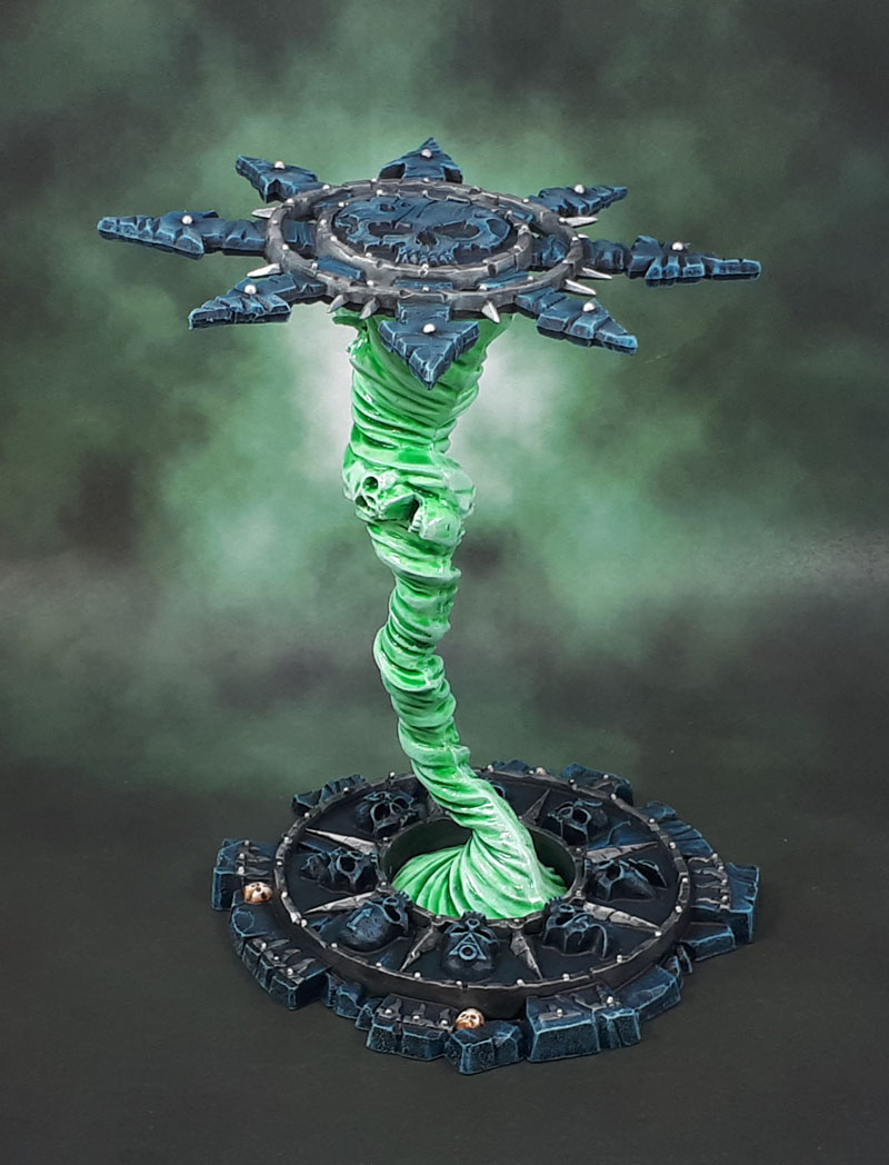
Originally released as part of a larger kit towards the final days of WHFB, alongside the Magewrath Throne (that used to sit atop a stack of giant skulls), the two have now been split into smaller kits, and the throne has lost it’s skull-riser. More on that in another post, later.
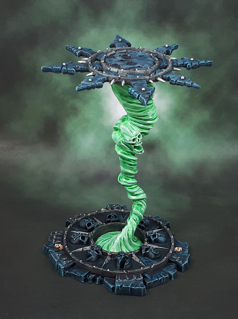
The Balewind Vortex is a simple terrain kit, coming in only 4 pieces. Base, Top and a two-part whirlwind. Or balewind, I guess.
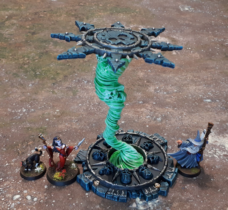
Having been fairly indifferent to the concept of The Winds of Magic since they were first introduced in that White Dwarf article, I was happy to basically copy the current box art. I quite like the greenish-shaded off-white look that GW has been using for much of it’s undead since the Return of the King’s Army of the Dead introduced the overall scheme and effect.

Slightly embarrassingly, it seems that I ordered another one of these things a couple of weeks ago, before starting on this one, which has just arrived. I don’t know if I’ll be able to care enough about it to give it a yellow-red gradient like the one in the original Warhammer promo box, though – I’ll worry about my options there later!

Great painting on the vortex, the green glow looks fantastic. Was ordering the second one an oversight, or was it intentional ?
LikeLiked by 1 person
An accident – I didn’t realise that I had this one. Then by the time the order shipped, I’d found and painted this first one – and forgotten that I just ordered the second one!
LikeLiked by 2 people
Looks ace – I’m sure all eyes will be drawn to the magical vortex itself but you’ve also done a really nice job on the stonework.
LikeLiked by 1 person
Thanks, Wudugast – I finished the vortex in gloss while the stonework itself is dullcoated, to try and differentiate them a little more.
LikeLike
You could use the new-ish blue ghost paint on the other Vortex perhaps. Might get you interested enough.
One Balewind Vortex is likely as many as a guy would ever be arsed with though, I reckon.
As mentioned above, the blueish stone is nice, good job.
LikeLiked by 1 person
Thanks mate. I used the greenish tint on this one, so perhaps the blueish one if I just paint it as-is. I might see if I can cannibalise the three main elements into different scenery pieces instead, though.
LikeLiked by 3 people
Nice job on this one mate – if I were you, I’d just use the top of your spare kit as a chaos themed ninja star! 🙂
LikeLiked by 2 people
I’ll have to see if someone can cast them in metal!
LikeLiked by 3 people
Yikes!
LikeLiked by 1 person
I know a guy…
LikeLiked by 3 people
Nice work man. Once again, kicking butt over the boxed cover! Oh, this is your blog, Kicking Ass!
The green looks great, and has already been mentioned, blue would be cool for the second.
LikeLiked by 1 person
Thanks Faust – if I do go for a second “normal” build, I’ll likely use the blue variant of the Nightshade paints (or whatever they’re called). I’ll hold off on that for at least a little while, though.
LikeLiked by 1 person
Looks great! I like the use of the gloss and matte finishes to further differentiate the pure magic and material portions.
I still haven’t used the stonework portions of the one I got, but I cut the vortex in half, and used it instead of the flight stands for a couple of Heralds of Tzeentch on Disks. It makes for a pretty cool effect there.
LikeLiked by 1 person
Sounds like a pretty cool use for the vortex. The base especially looks like it could be easily used for a portal, or summoning circle, or just a chunk of warhammery ruins. The star can easily go onto almost anything chaosy or a decent size. It’d certainly fit on a knight. I wonder how it’d go on a Land Raider or other large vehicle?
LikeLike
Yeah, I’m sure I’ll find some terrain project or something that the other bits work well on. It just hasn’t come together yet. The star is too big to really look good on even a Land Raider, altho maybe if you cut it in half, and put half on each side or something.
LikeLiked by 1 person
Yeah, I don’t need to rush into mine, so I’m sure one of us will find an interesting use for the bits eventually and have them posted up!
LikeLike
Looking good.
Cheers,
Pete.
LikeLiked by 1 person
Thanks Pete!
LikeLiked by 1 person
What a cool piece. Glad you went with green too
LikeLiked by 1 person
Love it mate ,I’m glad it’s not just me that buggers up orders ! when I started buying on line I managed to not only buy one set of Strelet Indians but three ! ,any one need some Indians !! . I’m still working on my hope of getting my first go at your challenge ,after a bugger of a set back I’m back on track and hope to be able to submit my project for the month ! .Bugger me months do fly past quickly ,or is it only when you are old !!.
LikeLiked by 1 person
I’ve done that way too many times. Or very occasionally, you’ll add something to an online cart twice and not notice. I’ve ended up with an extra wargaming mat that way! Still sitting in it’s box…
Hope your situation stays good, and you can get your stuff done!
Life definitely flies by the older you are. Weeks, months, years!
LikeLiked by 1 person
Oh gosh as Dave would say ,I’ve had another set back! but now I’m so f..g determined nothing is going to get in the way of getting this bloody castle getting done on time mate !!! .
LikeLiked by 1 person
There’s still one more week!
LikeLiked by 1 person
Pingback: Sunday catch-up
I do like the green and it’s the first time I’ve even noticed the faces in the vortex lol (I’ll put that down to your painting emphasising it, rather than my tendency to gloss over this as one of my least favourite bits of GW scenery).
LikeLiked by 1 person
I never would have looked at it twice if not for one incredibly important consideration – it was really cheap!
LikeLiked by 1 person
Nice vortex, love the green. Just get amazed that the folks at GW need to invent more words/terms…wtf is a balewind? Maybe it’s caused when an agrax drinks too much null oil…
LikeLiked by 1 person
Or nuln oil, even my iPad has issues with GW!
LikeLiked by 2 people
There *is* a somewhat valid reason they did this – Their old paints always had creative “Warhammer” Names – Skull White, Chaos Black, Bestial Brown, Orc Brown, Dark Angels Green, Goblin Green, etc – so it was a mixture of descriptive and being cute about it. You’d use Space Wolves Grey on your Space Wolves, or Ulramarine Blue on your Ultramarines, or the aforementioned Dark Angels Green on the Dark Angels.. you get the idea.
What happened, was that Games Workshop was very popular. Vallejo came along, and seeing those names, co-opted them for colour-match paints. Now you had Ultramarine Blue and Goblin Green in more than one range, since you can’t copyright “Ultrmarine” or Goblin”, but you also had “Wolf Grey” and “Angels Green” and the like. Pretty much a 1:1 reproduction of their paint range.
Then Army Painter showed up, saw what Vallejo was doing, and did it as well.
So GW redid their entire range. All paints were retired (excepting those that could not be, like Black and White and not much else). Some had new ones that were very close, but not all did. All paints were renamed, with even more Warhammer-y (and IP-protectable) names, but without the real-life colour descriptor on a bunch of them. Now instead of “Snakebite Leather”, we have “XV-88”. Instead of “Scorched Brown”, we have “Rhinox Hide” – and so it goes. Hence now we have “Nuln Oil”.
I should turn expand this and turn it into a short blog article sometime…
LikeLiked by 2 people
Thanks, I knew some of this but not all. Marketing is marketing and I get that. I see far too many instances where the English language, even as practiced by we Americans, is poorly utilized. Grammar use is weak, and that’s a challenge – but weak vocabulary knowledge is a greater problem. On principle, I’d like the paints’ names to reflect that, but maybe I am showing my age. (Or possibly those marketers are not adept in the use of perfectly good English). The irony of course is that they ARE ENGLISH (or at least British). The main downside for me is trying to figure out what color is what, and how to use each. I do like Citadel paints (and other folks’ paints as well). I just prefer not to speak any company’s marketing lingo. When I hit Starbucks for iced tea (not a coffee drinker) I always say 30 ounce, never “trenta” or any other thing. Then I get my beverage from the “barista” and mutter about the good old days 😁
LikeLiked by 2 people
Oh, I see what you mean, and I’d personally much rather that the paints names made more sense – but it is what it is, and if you or I are telling each other what paint or wash we used, we’re forced by the nature of the product to call it “XV-88” or “Nuln Oil”. At least many of the paints still have exotic terms like “blue” or “green” as part of their names, so you’ve got some idea of what they might be! 😉
Not a coffee drinker? And you’re an American? Unheard of!
LikeLike
Pingback: Warhammer Underworlds: Nightvault Arcane Hazards #1 (February Terrain 2019) | Azazel's Bitz Box.
Pingback: Scotia Grendel 10015: Daemonic Altar (June ’19 Terrain Challenge) | Azazel's Bitz Box.