How excitement! Yeah, I know. These aren’t the most impressive or exciting pieces, but they’ve been hanging around for years unpainted, so I managed to finally get them done and into the terrain cupboard. These actually aren’t the originals from my own 40k 3rd Ed set – I did actually get those done a few years ago.
Instead, these came from a batch of second-hand models I got years ago, along with other bits and pieces, including a crashed Aquila Lander missing it’s tail fin. I still need to finish my first one of those first, though (didn’t get it done in Jan of Feb).
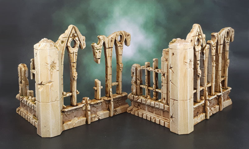
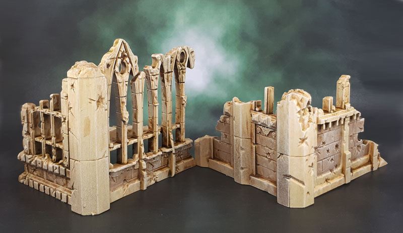
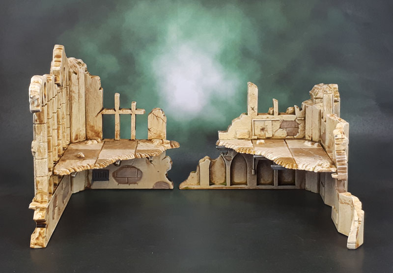
Being models that I got in a more or less random box is also why some of the pieces were mismatched and (in some cases) missing, so I decided to also build these based on making slightly different corner combinations to the “proper” ones. (And patched the corners with putty!) At this point, years ago, the idea was still to paint them in the same manner as my existing (grey) ones.

At some point – last year, I think – I sprayed them in a cream/bone colour. The idea now being to paint them to go with a more arid or desert-y table. At that point, they got forgotten about again for several months until this challenge got them out. As it happened, these were the perfect kind of models to paint while Dad was in hospital again. Simple on so many levels, but an achievable task.

Since then, the Sector Imperialis terrain has been released, with the “showcase” pieces being in a similar colour, so I decided to press on with them, and also use them as test pieces for my own take on that style of scheme to – in turn – help me decide how to paint my Sector Imperialis stuff.
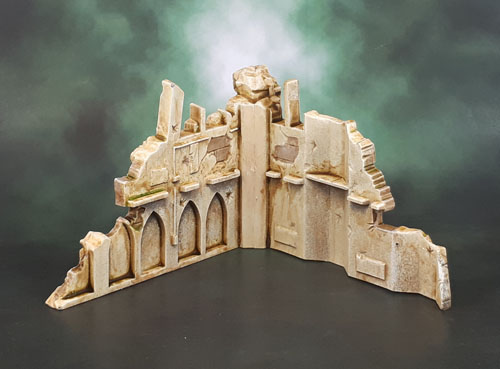
The paint then was done in a “quick and dirty” manner. Sprayed (gloss) cream from the hardware store. A few details picked out, such as the exposed bricks under the plaster and the grates. The whole lot was then drybrushed with a bone/off-white. Next up was an all-over wash with Vallejo Model Wash (thanks to Dave Kay from Scent of a Gamer for the heads-up on this stuff existing!) followed by a wipe-off while it was still wet, to get that combo wash/stained effect.
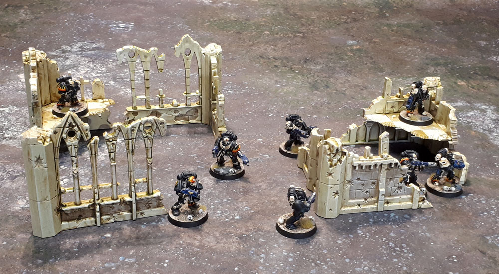
In the end, I have another 5 pieces of smaller-but-modular terrain that are generic enough to again fit into many genres and timelines. I think that they look pretty decent in the shot above with the LotD moving across them. They’ll look even better with other terrain around them in a proper gaming situation!

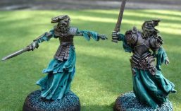
On an unrelated note, Leonard the Cat appears to have truly gotten a big head due to all of the recent attention!

More solid terrain dude – lookin’ good!
LikeLiked by 1 person
Cheers Alex. “Solid” is a good word to describe them.
LikeLiked by 1 person
Nice pieces, they will look the business on the gaming board.
LikeLiked by 1 person
Thank you, TIM. Hopefully I can get some more games going this year so I can get them out and used!
LikeLiked by 1 person
Nice work…one of the few good things about 3rd ed!
LikeLiked by 1 person
Hahhahaha!
LikeLiked by 1 person
They look great- the pale sandstone suits them better than grey.
Cheers,
Pete.
LikeLiked by 2 people
I think both look good, but the sandstone style colour is a kind of “breath of fresh air” after we’ve all spent decades looking at drab grey buildings.
LikeLiked by 1 person
Very nice rendition, and makes a great change from seeing the normal grey
LikeLiked by 3 people
Yeah. I have a bunch in standard grey and they look fine – but these look a bit nice as something different.
LikeLike
I’ve always liked those ruins, and was kind of disappointed when they were discontinued. They look great in the off-white like you’ve got them here, and I may have to repaint mine similarly.
:3
LikeLiked by 2 people
If they were available as a set these days at a reasonable price, I’d definitely pick up one or two of them. I wonder if there are any on eBay?
LikeLike
nope! Well, one set halfway across the world with a packet for postage…
LikeLike
They really do look good in the pale sand/cream! Excellent portrait of Leonard!
LikeLiked by 1 person
Thanks – and as for Leonard, he’s just naturally photogenic. Even when he’s being an arse!
LikeLiked by 1 person
Great work on these. I really enjoy the two-tone colour scheme that highlights the brickwork separately from the rest of the masonry. Looks class.
I think these things came out about 2 years after I got into the hobby for the first time, so they spark a little bit of nostalgia in me for sure! Looking back, I guess these and the jungle trees that came out at the same time represent GW’s first baby steps into a brave new world of plastic scenery after years of cardstock firebases & bastions – kind of incredible to think of how far scenery kits have come in that time.
LikeLiked by 2 people
Thank you. Often just picking out the little bits of detail (without going too crazy) can really bring a piece of terrain to that next level over leaving it all grey (or whatever).
The Jungle Trees! I still have those! On the sprue, even… 😡
LikeLiked by 1 person
I like the pale stone colour
LikeLiked by 1 person
Thank you – I may well repeat it on a few more pieces. It still works in an urban landscape, which is a nice touch.
LikeLike
Nice mate. I like the colours you’ve gone for
LikeLiked by 1 person
Thanks mate – they’re a little less common then the usual scheme.
LikeLiked by 1 person
I’d love to have these on a tabletop. Nice stuff!
LikeLiked by 1 person
Thanks, Mark! 🙂
LikeLiked by 1 person
Yep that colour is an excellent way to set it apart from the usual gray blaa of most Emperium you typically see! Awesome stuff! Plus Leonard deserves it! Being a very cute cat is hard work ;P
LikeLike