

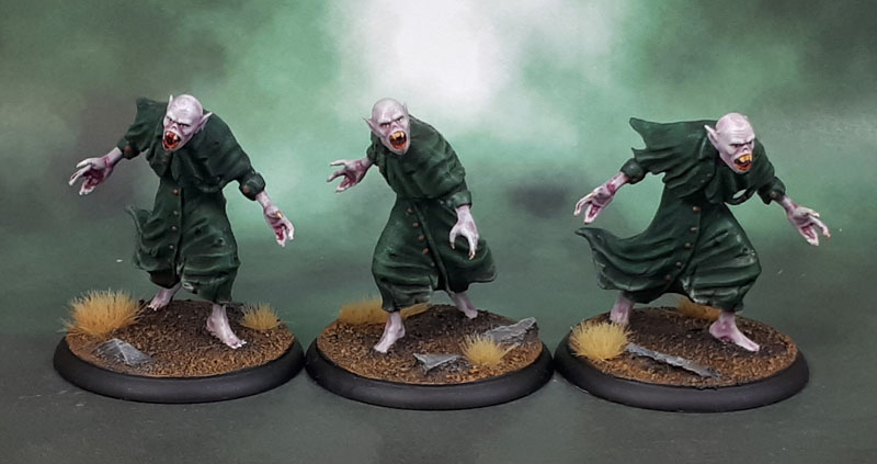
A several day break and then more Shadows of Brimstone models! Am I trying to tank my blog’s views? Half-jokes aside, once again these aren’t good models. The good old “easy wins” motivation based on them being quite simple looking on sprue, plus the chance to try out the Contrast Paints in a much more involved way got these going. I went with the three different coloured coats for the dual purposes of variaton, as well as (3) grunts, (2) elites, (1) leader should that kind of breakdown ever be needed. I left dark red available in case I have the resin “hero” figure somewhere in the mess of a Kickstarter delivery that this game had.
The official package (which I didn’t get – because Kickstarter) artwork quality is straight from RPG sourcebooks circa 1992.
Painting was pretty simple. They were all sprayed Grey Seer and I basecoated the coats in Contrast Dark Angels Green, Ultramarines Blue and.. um.. one of the browns. Gore-Grunta Fur maybe? Unfortunately, it looked …a bit shit. So I gave all three types some drybrushing to add some nice nuance to the colour and then a wash to finish. Yes, Contrast by itself wasn’t good enough for these shitty models. To be fair, I blame the sculpts as much as the paint. Thinned (with Medium) purple for their heads, snakebite leather over a yellow-white for the nails and teeth, and some Blood Angels Red for their mouths and the blood effects there – which was originally a bit of slop on the first couple that I intended to overpaint, before I decided to keep it and go with it on the rest. That’s pretty much it.

So what did the Contrast paint add to the process of painting these models? Well, I guess motivation was a big part. They’re pretty mediocre models, so the idea of spending normal amounts of time painting them in the normal manner did not appeal at all, while simpletown Contrast painting did. Could I have gotten pretty much the same effect if I’d used traditional paints on these, as well as thinning my Army Painter Purple wash for the skin? Yeah, pretty much, although a bunch of their native shading is still quite evident on these models. On these, though – the Contrast Paints special powers are pretty negligible because I wasn’t satisfied with how they came out.
But that’s really what I’m working out here. I’ve painted for over thirty years using basically the same methods, or more accurately, building on the same methods I learned as a kid/teen. Now these new paints have come along – and despite what too many people with more mouth than experience will tell you (especially on places like Dakka) – are not exactly the same as painting with washes or Les Bursley’s custom washes. They have similarities for sure, but they are different, and because I don’t have my head up my arsehole – I see a new set of tools and am figuring out how to use them and where and how they fit in my workflow.
Aside from “dedicated” models like these, I do find them really useful for small spot-points of shading, as they’re denser than traditional washes but more translucent than paint washes, and I’m finding that a lot of them are getting regular use in that manner.
As for these models? In the end, I have six more not-good-but-not-terrible completed models for the boardgame and any other use that might come up on the tabletop. Now to prep another little batch of nonsensical Brimstone models for the next lot…

Enjoying reading your thoughts on these contrast paints, I haven’t rushed to buy any as I wanted to wait and see if it was just a marketing ploy, love your honest opinions on them and may get a pot to experiment with and if I like it may get some more.
Even those these were quick finish models to get off the bench you’ve worked your normal magic with them and they look good
LikeLiked by 3 people
Thanks Dave. If you’re planning on starting slowly and don’t have any specific thing that you want to paint with them, I’d go for the white, one of the darker browns, snakebite leather, and then possibly one each of the primary colours. I also use them as much over coloured bases at this point as the two “official” base coats. Using them over colours, like a wash can be good for depth, as the under-colour (obviously) makes a big difference to the final look.
LikeLiked by 2 people
I really like how they turned out, the drybrushing looks natural and smooth. I had some difficulties with that. When I used the contrast paints I always had this nagging feeling that the models would probably turn out better with regular paints. I wonder if the opposite had been true if I started with contrast and swapped to traditional years later. I’m still very curious of their potential, and I think I will use a mix of both types on my next project. Also want to try them as wash.
LikeLiked by 3 people
Just think of them as another tool. I mean, if you use pre-made washes and glazes, then it’s another thing that can fit in alongside them. I knew a guy back in the 1990’s (Dave, of the Khorne Dreadnought) who pretty much exclusively painted via base coats with Windsor & Newton Ink glazes of various colours over the top. Just another tool with a set of techniques. For a fair few people, Contrast paints might work better than regular paints as they do manage to get a lot of that subtle gradients when shading a section of model. Like the way people use a flesh wash, only more gradiated and subtle (if you use medium alongside!)
LikeLiked by 2 people
Agreed and very inspirational with people who use «unconventional» methods. Lately, through my inq 28 «research» I see some use oil paint and white spirit to get the blanchitsu effect on miniatures too. A bit daunting, but very cool:)
LikeLiked by 2 people
Oil washes can give a great effect. I’ve done a little of it, and have a set of oil paints especially for, though the cleanup (and smell) discourage me from using it nearly as often as I’d otherwise like to.
Maybe I’ll be able to do it more once I clear this goddamned desk up of so many half-painted models?
LikeLike
I think if there were just one of these, it might have seemed like a slightly better sculpt than when there’s a half-dozen of them standing together making it so blatant that there’s no variation. Well done on bringing out as much detail as they have!
LikeLiked by 4 people
Sure, there’s variation – there are *two* poses. Ok, they might look almost like mirrors of one another, but hey!
Seriously though – I feel like models like this (and so many of the others) are a good example of Flying Frog’s “boardgame company” heritage, as opposed to “miniatures company”. Especially in these models from the first SoB campaign.
LikeLiked by 2 people
OK, that’s a good sign of how bland the sculpt is: I didn’t even notice that some of them were mirrored.
LikeLiked by 3 people
Yeah, that’s a good way to put it!
LikeLike
I like them! Once again, Dave’s basically written my comment for me! 🙂
LikeLiked by 3 people
You can always copy and paste John ! LOL
LikeLiked by 3 people
Thanks ̶D̶a̶v̶e̶ John. If you’re planning on starting slowly and don’t have any specific thing that you want to paint with them, I’d go for the white, one of the darker browns, snakebite leather, and then possibly one each of the primary colours. I also use them as much over coloured bases at this point as the two “official” base coats. Using them over colours, like a wash can be good for depth, as the under-colour (obviously) makes a big difference to the final look.
LikeLiked by 3 people
Interesting to read your take on these contrast paints. Haven’t tried them yet but think I will get a pot or two in the near future.
LikeLiked by 3 people
They’re like a thick acrylic wash, but with a bit mroe “stick” in that they don’t and won’t all immediately gravity-pool to the bottom of the figure. (though that still happens, just to a lesser extent).
LikeLiked by 3 people
The models are cool, creepy but also kinda funny 😂 fair review on the contrast paint, I have read a lot of reviews where folk just use it like a wash and expect the same results. I’m just getting my head around the technical paints for the time being 😂
LikeLiked by 2 people
Heh yeah, it’s in between a normal wash and a paint, and can be used as either – though in various situations and even the different Contrast paints work differently as some are MUCH more opaque and/or darker than others.
LikeLiked by 2 people
I’m tempted to give one or two a try a little down the line, they seem like an interesting idea. There are some space marines in the cabinet in my local GW that each were done with a different contrast paint and the results were superb.
LikeLiked by 2 people
I think they’re a nice addition to the other types of paint that many of us use (Foundation/Base/HD, premade Washes and Glazes, Gemstone, other various technical paints, etc.) Just see what might be useful for you in your current projects and grab a couple to play with and incorporate a little. No need to do what I did and grab the whole set unless you’re a paint junkie.
LikeLike
For what it is worth I really like these. The paint job really suits them and (I know it is heresy for a goth to say this but) I prefer my vampires to be more monster than suave….
Cheers,
Pete.
LikeLiked by 3 people
A goth! I used to do that myself in the dark past, but I’ve mostly moved on. I mean, I still like a lot of that music, though I don’t listen to it as much (well, some of it) and still wear a lot of black and dark colours, but you’d never pick me now with my big greying beard and hoodies. 😀
LikeLike
I’ll join the ranks of those who rather like these models as well, and (no surprise) you’ve done a good job on them.
As for the contrast paints I’m enjoying following what you do with them as I’m in a similar situation, trying to work out how to incorporate this new tool into my existing painting style. As for the moaners, sadly some people just think it’s cool to moan and be down on everything all the time without knowing the first thing about whatever they’re talking about. I try to ignore them, they’re the poor bastards that have to live with themselves after all. On the other hand, in situations like this, when I want to get other people’s thoughts on something it’s great to hear some valuable first hand experience rather than wading through a morass of self-important complaints and supposition. Keep up the good work! 🙂
LikeLiked by 3 people
Thanks mate – you and the others are a bit too kind at times. They’re fine for the tabletop, but nothing exciting, either!
Too right on the people who just like to complain – and often just any excuse to hurl shit at GW – who deserve a lot of grief for various reasons, but at least get your reasons right!
Very welcome on my Contrast thoughts – I’m finding it useful to document my own process and hope others continue to do so as well. 🙂
LikeLiked by 1 person
I quite like the models in all of their mediocrity, and you’ve done a good job on them. As Alexis pointed out above, as a single model one of those would look less mediocre, but they’re not terrible as a group. I’ll echo the other people saying these contrast paint experiment posts are really useful, thanks for that!
LikeLiked by 2 people
Thanks Mikko. I’m sure they’ll be just fine as boardgame models whenever I get around to playing Shadows of Brimstone. Of course, more experienced miniatures people like the majority of us tend to look at them with a more critical eye. Certainly more critical than the Flying Frogs did!
LikeLiked by 1 person
They don’t look too bad mate, and always good to get another person’s take on the new magic paints… I have yet to take the plunge on them myself, and don’t really feel the need to!
LikeLiked by 2 people
Thanks Alex – honestly, you probably wouldn’t regret grabbing a small few of them and just treating them almost like thicker washes. I’m still experimenting on them and the different colours, and of course, I can’t resist mixing them as well to see what happens. More on that soon…
LikeLiked by 1 person
I do like these, great painting on them. Regarding Contrast Paint. It is really helping me get my 15mm armies painted up quickly. Yeah I know I am being lazy and just using the Contrast ‘neat’ but I am certainly churning out armies at a rate of knots. I have tried it on 28mm stuff for proxy Mobile infantry and I was pleased with it, but I really do need to play around with it more.
LikeLiked by 2 people
Ha! That’s fine – use them however works for you. I think smaller models are probably a bit more forgiving at using them stock as well. These SOB models tend to be larger than standard 28mm ones, so the little problems are writ larger and far more visible on them.
LikeLike
Great post and I have been enjoying the Contrast Paint discussions. Of course, I have acquired all of them over the last few months. I am mid-project on a September squad of 1979 figs that I am trying them on – over a white base. Similar model—quality-wise in that many are my own recasts and needed a lot of green stuff fixing. Like you, I am learning to use the cp’s and will try them over a base coat of a different color at another time. Opacity does indeed vary, and I have not tried to thin or dilute with medium, but the Volopus Pink sure could be a candidate. I think so far I feel they are good, but still need washes and dry brushing. We’ll see how I do. Thanks for sharing AZ!
LikeLiked by 2 people
If I could offer one bit of advice to you, it would be to get the medium and put it into a dropper bottle. It makes the medium’s use much easier and by extension adds a lot more flexibility to the paints.
LikeLiked by 1 person
Thanks. I use 5 ml syringes and they do help. My next project for September’s challenge needed them!
LikeLiked by 1 person
I clicked on and for a moment all I saw were a heap of angry Peter Garrets !!
LikeLiked by 1 person
The posing is about perfect, too!
LikeLiked by 1 person
I’ve no idea what Shadow of Brimstone is but seems worth looking into
LikeLike