
Lobster, anyone?
I decided some time ago that I should paint up some of the zombies from my Zombicide games, and given just how bloody many of them there are, the best place to start would be with the “hero” zombies – which pretty much means the Abominations. So I selected them from my box o’ zombies, washed them down (well, Marouda did that), and then put them in a container awaiting paint.
Then quite a few months went by. Then the Contrast Paints came out. Then at some point, I decided that these boardgame zombie models would be another good place to experiment with the Contrast paints in order to get the models done that much faster while still making an effort to make them look decent. They’re a bit crazy looking, but they’re still better than a lot of the Shadows of Brimstone models…

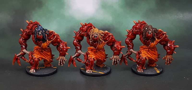
This time I decided to make use of them predominantly as the main method, and then use regular paints and methods for finishing and finer details. With that in mind, and the reddish plastic of the Berserkers (which also serves as an easy differentiator in the game) I went for a (cooked) crustacean kind of look to their armoured plates, using a mix of Blood Angels Red and Flesh Tearers Red, finished with gloss – with patches of pale skin mostly to add some visual interest and break up the large areas of red, even though I could have easily justified the whole of their bodies as shell/carapace. I also did their prison jumpsuits with contrast Gryph-Hound Orange mixed with Iyanden Yellow for that nice, bright look to them. I decided on three colours of hair to make identification in-game a little easier “move the blond one”, etc. The hair strands on top of their head had to be painted in, since the minis were perfectly smooth, and it looked pretty crappy. I also highlighted their spikes and claws with regular paint, as well as painting in their eyes and teeth.
They still have a “painted with washes” look to them, and the left hands are a bit rough, but overall the higher level of detail on these models works much more effectively than the recent Brimstone models I’ve used the Contrast Paints with, giving a much more effective and nicer result. I see more Contrast Paint Zombicide Zombies in my future…
Oh yeah. Three models makes for a squad by the rules of this month’s painting challenge. It also serves to illustrate a strong part of why the minimum for a squad of for 3 rather than 5 or 10. It allows people (not just me) to get boardgame models or larger wargame models that typically come in smaller unit sizes painted up and have them count.

These look good mate, and great to see more use of the contrast paints and their effectiveness. It sounds like the more detail on the model, the better the results
LikeLiked by 3 people
Thank you Dave – I think that’s a good description, along with the depth/sharpness of the details. Lots of the SOB stuff suffers badly from shallow and soft details.
LikeLiked by 1 person
A nasty looking bunch! I think they’re great, painting’s come out spot on! 🙂
LikeLiked by 3 people
Thanks John – just started another trio of similar ones now. 😉
LikeLiked by 1 person
Impressive work on the hair. I never would have guessed they didn’t have sculpted detail there from the pics. Can’t say I’m a fan of the sculpts, but you’ve done well with what’s there.
LikeLiked by 4 people
All of the original Zombicide sculpts (up to Invader) are based on Eduard Guitton’s artwork, so they’ve got that sort of cartoony style. The larger models are of course much more over the top than the smaller ones…
LikeLiked by 1 person
Actually… no comments about Dave Mustaine’s hair for the middle one? 😉
LikeLiked by 1 person
Ha! But no. He clearly doesn’t take anywhere near sufficiently good care of his hair. It’s all stringy and gross.
LikeLike
Really like how these turned out! The bold color choices really stand out and with the size of these models, I think Contrast paints are the way to go. For their age, these are some nice board game sculpts with more detail than many had at that time. You got me looking up reviews of Zombicide now which is dangerous for me and a tribute to the great job you did on this squad! 🙂
LikeLiked by 1 person
There’s a second edition of Zombicide coming soon. Well, the KS comes soon, followed by about 18 months for the campaign to actuall ship. It may rely a bit *too* much on an app, though. And I’m personally not in favour of disregarding my huge ZC collection, so not sure if I will buy into it myself. The previous seasons’ standalones are still good value, though – and there are plenty of free scenarios on the ZC website, too!
LikeLike
I’m with Alexis on the hair comment ,well done mate .
LikeLiked by 2 people
Thanks Pat – the lack of detail with the hair is only on the tops and sides of their heads, the long, flowing locks are actually detailed. It’s quite a curious sculpting choice, to be honest…
LikeLiked by 1 person
Those are some mean looking mothers… like the red and orange
LikeLiked by 1 person
Thanks mate. Once I get all of the Abominations done, I may have to start on the Fatties. God help us then, there’s so many of the bloody things!
LikeLiked by 1 person
Those are great. Very vibrant colours which I think wins out over the ‘painted with washes’ look.
Cheers,
Pete.
LikeLiked by 1 person
Thanks Pete, I reckon how good the “painted with washes” vs “super-vibrant” look really depends on the mini – both the quality and what they are. Nurgle stuff and regular zombies seem to work especially nicely with washes, while these crab-carapace “zombies”/infected work better with the stronger colours.
LikeLiked by 1 person
Nicely done mate and good to see the results of using contrast paints. I think it was said earlier that the better the figure in terms of detailing the better they work. Something I have still yet to try but will get around to at some point.
LikeLiked by 1 person
Thanks. I’m working on another trio of Brimstone minis now, and the Contrast Paints just aren’t doing well on the garbage-tier details of them. The Zombicide Abominations on the other hand, pick the stuff up quite nicely…
LikeLiked by 1 person
I guess it is trial and error both in terms of the paints but also in respect of finding the detailed figures which are most suited to them. Some how I think you will resolve this to great effect!
LikeLike
It’s all learning, and I have to say that even on the garbage-tier figures, I’m not entirely sure I’d want to spend the time doing them in a more traditional manner anyway!
LikeLike
They’re a lairy bunch mate! Love the toxic colour scheme 🙂
LikeLiked by 1 person
Thanks Alex. I loke the choice of words to describe their colour scheme, actually…
LikeLiked by 1 person
Nice work! They’re definitely a rough-looking bunch and I like the colors you went with. 🙂
LikeLike
Pingback: Zombicide: Black Plague Green Horde – Orc Abomination (Contrast Paint Experiment #20) | Azazel's Bitz Box.
Pingback: Zombicide Season 2: Prison Outbreak – Berserker Zombie Fatties | Azazel's Bitz Box.
Pingback: Zombicide Black Plague: Zombie Bosses – Ablobination, Abominatroll and Abominotaur | Azazel's Bitz Box.
Pingback: Zombicide 1st Edition, Season 2: Prison Outbreak – Berserker Runner Zombies + Bonus Fatties, part 1 | Azazel's Bitz Box.
Pingback: Zombicide 1st Edition, Season 2: Prison Outbreak – Berserker Walkers Pt.1: The Prisoners, Berserker Runners Pt.2 | Azazel's Bitz Box.