As with the Reaper Giant Snake I posted up yesterday, this model is also one that had been clogigng up my painting desk. In this case, though – it’d been there for quite some time. I picked up this figure in the 1990’s from a range of models – the name of which escapes me now – but they had both Not-Cadian Imperial Guard and Not-Space Orks. They may have had Not-Marines as well. The name of the game I think started with an S, had a green cover and was printed in almost a horizontal-A5 format. Their faction of Not-Space Orks were called “The Org”, at least as I recall.
Anyway, at some point, Games Workshop, with their usual lack of tact and ignorance of the fact that they don’t own every fucking thing that they ripped off from Tolkien and threw into space, threatened them with legal action, and so this small company changed their “Org” faction from Orcs in space to “Organised Crime”, and started changing their sculpts into models that looked more like.. this. A kinda Americana redneck caricature look. I don’t fucking know. Anyway, I ended up with a bunch of these models and so they’ve sat half-or-unpainted for many years.
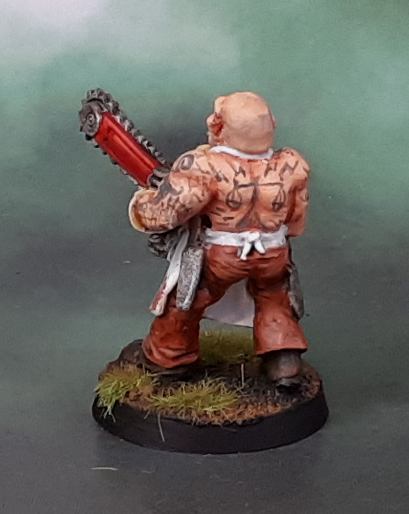
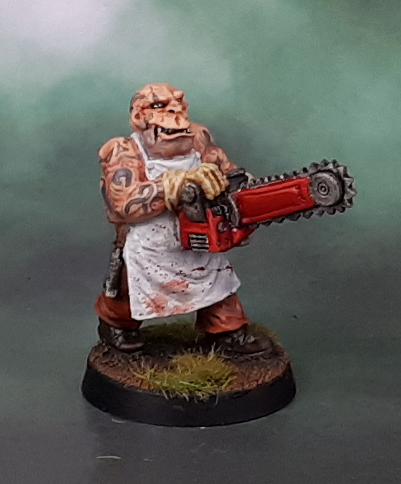
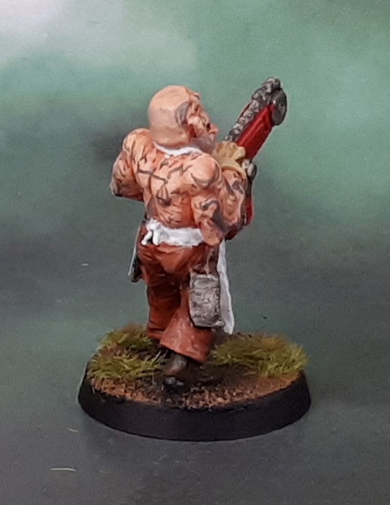
So I decided to paint the thing quickly to get it off my desk, and so I’d never have to worry about it again. After all, pants, flesh, apron boots. How long could it take to get it done and out of the way? Well, it was indeed pretty quick. All that exposed flesh, though, and that Texas Chainsaw Massacre/House of 1,000 Corpses look to him made me decide to give him a couple of tats. Which then went to sleeves, and then why not a back piece? I should have given it an Eden’s Gate tattoo from Far Cry 5 as the back piece! Fuckin’ Peggies!
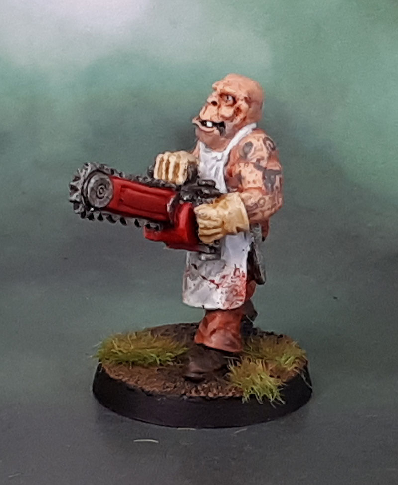
I mean, yeah. This model doesn’t “deserve” the work I put into the tattoos, but as what pretty much amounts to a disposable garbage model it was also something that’s totally free to practise on, with no stress if I fuck something up. I’m still trying to figure out a way to do “sleeves” that look realistic without just looking like the arms have been washed with blue-grey. I still wouldn’t say I like this model, but it’ll work okay as something like a Cursed Earth Mutie in Judge Dredd, or thrown into a mob of Chaos Cultists, or post-apoc something something. Job done!
Also – again – Dave Stone’s Paint What You Got Challenge.
edit – big props to Jeff Moore for IDing the model as well as the manufacturer and even the game. I knew there was an “S” in there, even if I messed up the faction!

Nicely done! 🙂 Blood spatter and tattoos look really good!
LikeLiked by 3 people
Thanks John! Gotta keep working on that ink, after all!
LikeLiked by 1 person
Nice! He’s ugly as hell but he’s a mutie so what do you expect eh! 😀
LikeLiked by 3 people
And if he’s not a mutie, he *should* be! 😀
LikeLiked by 2 people
Nicely done, there wasa company “Maverick Miniatures” that did some not Imperial Guard, and not Space Scaven mini’s back in the eighties/nineties was that them?
Cheers Roger.
LikeLiked by 3 people
Thanks Roger – turns out it was Dmonblade, as ID’ed by Jeff below. Thanks for the idea, though – when these things happen it’s always good to have people like yourself with a good knowledge of what’s been around. 🙂
LikeLiked by 1 person
Nicely painted; he certainly looks gruesome even without throwing in the fact he is packing a rather meaty looking chainsaw!
LikeLiked by 3 people
Thanks Ann. I noticed when I went back to edit in the proper name that I’d typo’ed the thing as “chainsword”. Shows something, eh?
LikeLiked by 2 people
Heh, yeah, it does. 🙂 I do the same thing a lot. When I was working on the board game pig demon the other day I couldn’t help but think he’d make a decent demon prince and I find myself having to backspace a lot when typing the word “demon” because I keep wanting to type “daemon.” 🙂
LikeLiked by 2 people
Your ugly mutie is one of the DemonBlade Shock Force Scarlet Brethren Good Ole Boys. There were 3 others in the pack. You can see pictures on the Lost Minis Wiki website.
LikeLiked by 3 people
Thank you Jeff! Much appreciated mate – and credit to you in the post as well. Cheers!
LikeLiked by 1 person
Because orruks or whatever sounds nothing like the urukai from tolkien that GW has now coined for their term for orks…
LikeLiked by 2 people
shhhhh! 😉
LikeLiked by 2 people
🙂
LikeLiked by 2 people
He really is an ugly bloke and the head looks kind of weird compared to the rest of the body but I love the paint job on this guy. I’m not a big horror fan but he does look like he could be in a slasher film to me. The tattoos really give him some character too so I’d say that was time well-spent, mate!
LikeLiked by 2 people
Yeah, he’s got a weird looking head (hence, mutie!) and the whole horror movie look to him. He did his job in the end as a tattoo-practice model. 🙂
LikeLiked by 2 people
Looking great. awesome painting,
LikeLiked by 2 people
Thank you! 🙂
LikeLiked by 1 person
Definitely a classic sculpt, but you painted it up nicely. Thr blood spatter and tattoos came out well. I don’t think I would have identified the tattoos on the arms as a sleeve, but I think the enormous muscles and slightly uneven surface makes it hard. You could try the effect on a more reasonably proportioned mini with smoother surfaces.
Applying the beard stubble technique and adding succesive glazes might be the ticket.
LikeLiked by 2 people
Thanks DB!
The beard-style greyed-out effect is what I’m trying to avoid though.
Even at a distance, most sleeves look like they have “bits” to them, even if they’re indistinct. There’s a sleeve variant I’ve seen that seems to be made of distinct pieces, and the “connective” stuff isn’t really black or grey (or clouds, etc) but little stars, crosses and other little symbols placed every so often in the white space. I was trying for that specifc effect here. I feel like it’s important to have at least a few identifiable objects (or whatever) in there so they still read as tattoos.
I guess it’s the abstraction that we need to have in models of this scale. Similarly I think monochrome tattoos work better than multicoloured ones on models, as I could see all that colour becoming confusing visually.
Point taken, though – I might revisit the stubble method for some of the middle space and see how that comes out. As long as I leave some bits of “white space” as well as the “stubble” and the “black work” it could be a winner. 🙂
LikeLiked by 1 person
Good points, I think I need to look at some sleeve tattoos more closely. Maybe it is really the oversized muscles that add difficulty. 🤔
LikeLiked by 2 people
Probably a mix of things. I’m no expert at this stage on painting tattoos either – which is why I often use low-importance models like this as practice canvas when they turn up in my queue. Larger and/or flatter areas of skin are indeed much nicer to work on, though!
LikeLike
Great work on that- love the tats.
The head reminds me of the Bad Taste aliens….
Cheers,
Pete.
LikeLiked by 2 people
That’s a good spot, Pete – I think they probably are a bit of an influence in these, especially given when they were produced!
LikeLiked by 1 person
Excellent work mate, the tats and blood splatter add another level in your usual style
LikeLiked by 2 people
Thanks Dave. I wanted a bit of spatter for colour on the apron, but nowhere near the levels I do on zombies and the like.. 🙂
LikeLiked by 1 person