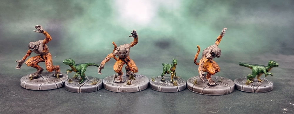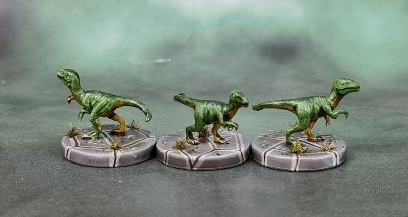
I’ve had these models – Shieldwolf Miniatures’ Krumvaal Lower Yetis for a few years now, as I picked them up from the Kickstarter when they were released, and have been wanting to paint them for awhile. I mean, I want to paint everything I buy, and whenever I sort through unpainted models in my collection, almost all of them do manage to “Spark Joy” and make me want to paint them – as do so many of the posts I read from members of this community. So with Swordmaster’s Monster March having been a thing very recently, I decided to paint my two sets of these Yeti (6 models in total), and although I got all six of them started and some way through them, I didn’t manage to complete any of them – but I did manage to push the first pair of them through to completion this month (April – so they will count towards my tally for Ann’s “Paint the Crap You Already Own!” challenge.
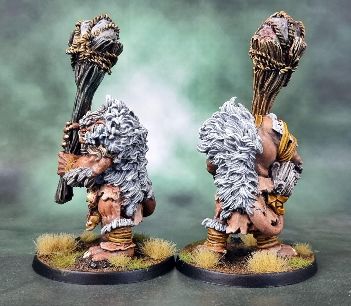
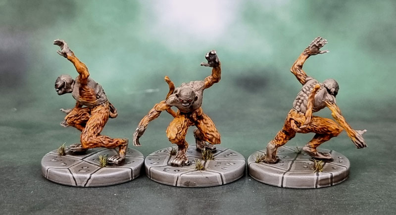
Unfortunately, these models weren’t easy or especially enjoyable models for me to paint in practise. I thought they would be, given the predominance of several simple textures that I usually enjoy – fur, skin, wood… but what I found was a lack of differentiation between the Yeti’s own fur and the fur cloak(s) that they wear, and so I had to scratch my head and try to decide how to differentiate them from one another, while still wanting to keep both of them a white, or at least dirty grey. Because Yetis. features like their ears blended in with the fur, and I’m still not entirely sure what’s supposed to be going on with the bridges of their noses..
For the actual painting, I wanted to try Contrast Paints and similar over a Zenithal highlight, since it’s supposedly a quick and effective method of getting some good looking results. Given that Yetis covered in fue are pretty outdoorsy and rough compared to, say Elves or parade-ground marines, I thought these were a good place to learn how that all works.
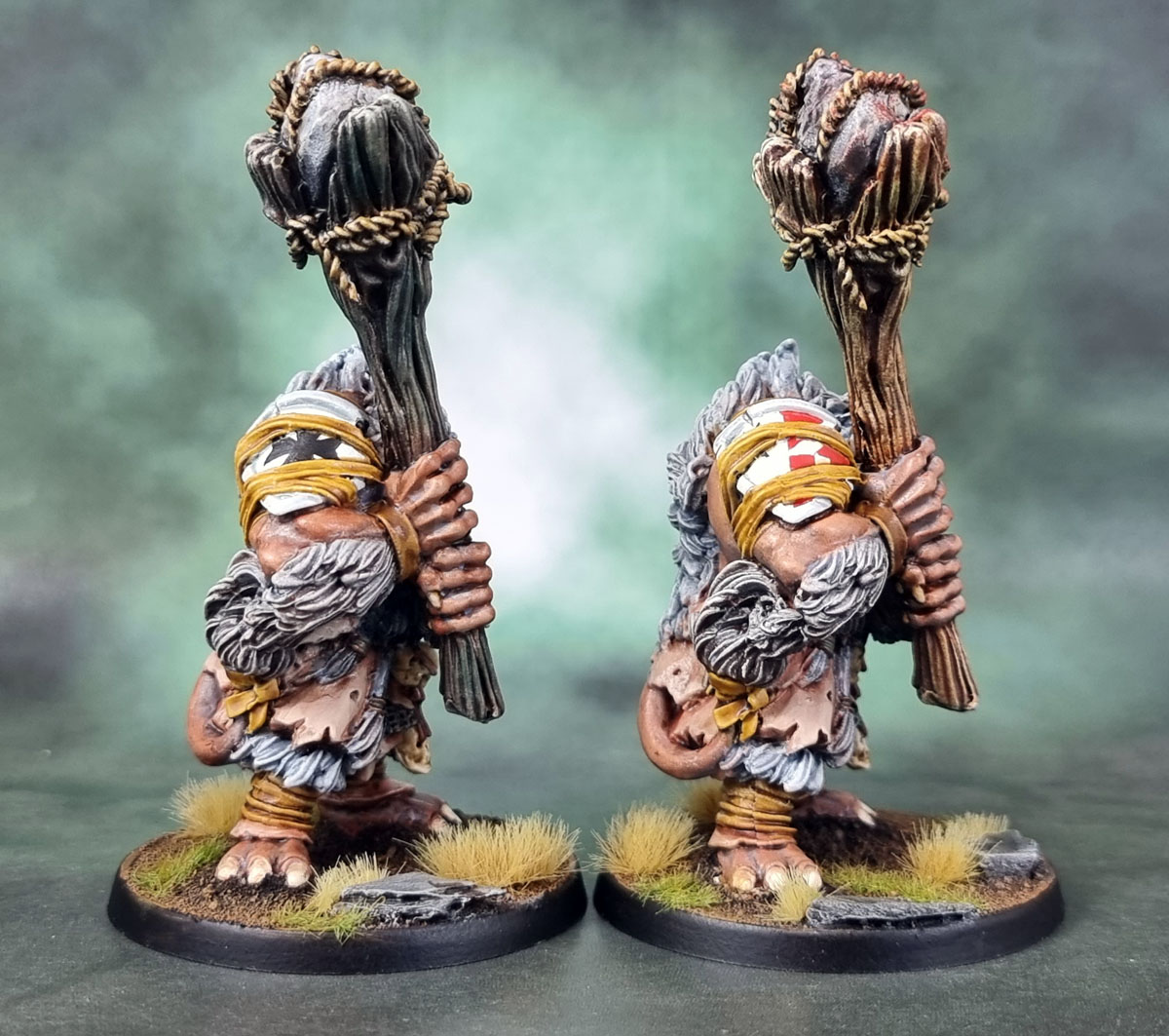
I was originally planning to give them greyish skin, but it turned out to be just way too much grey for me with the fur and their own body-hair-fur, so I ended up giving them a rich, darker tone for their flesh over grey in the base, which was something new for me. I also used several of Warcolours‘ Antithesis paints that I purchased a little while ago on these to see how they would work and look. The Anthithesis range are a Contrast-like paint, but with a gel base. They’re much thicker, and they are trickier to use than Contrast due to their thickness. I also have worked out by this point that the way I generally like to use Contrast paints isn’t the official “speed-paint” way, and for me they’re something to use in a variety of different ways, sometimes over primer but more often over a coloured base, and pretty much always combined with one or more of the more established, existing techniques. I think the result is, again, decent, but the experience wasn’t as pleasant as I’d hoped, especially as the “Contrast over Zenithal” thing did not work at all well with the Antithesis paints.
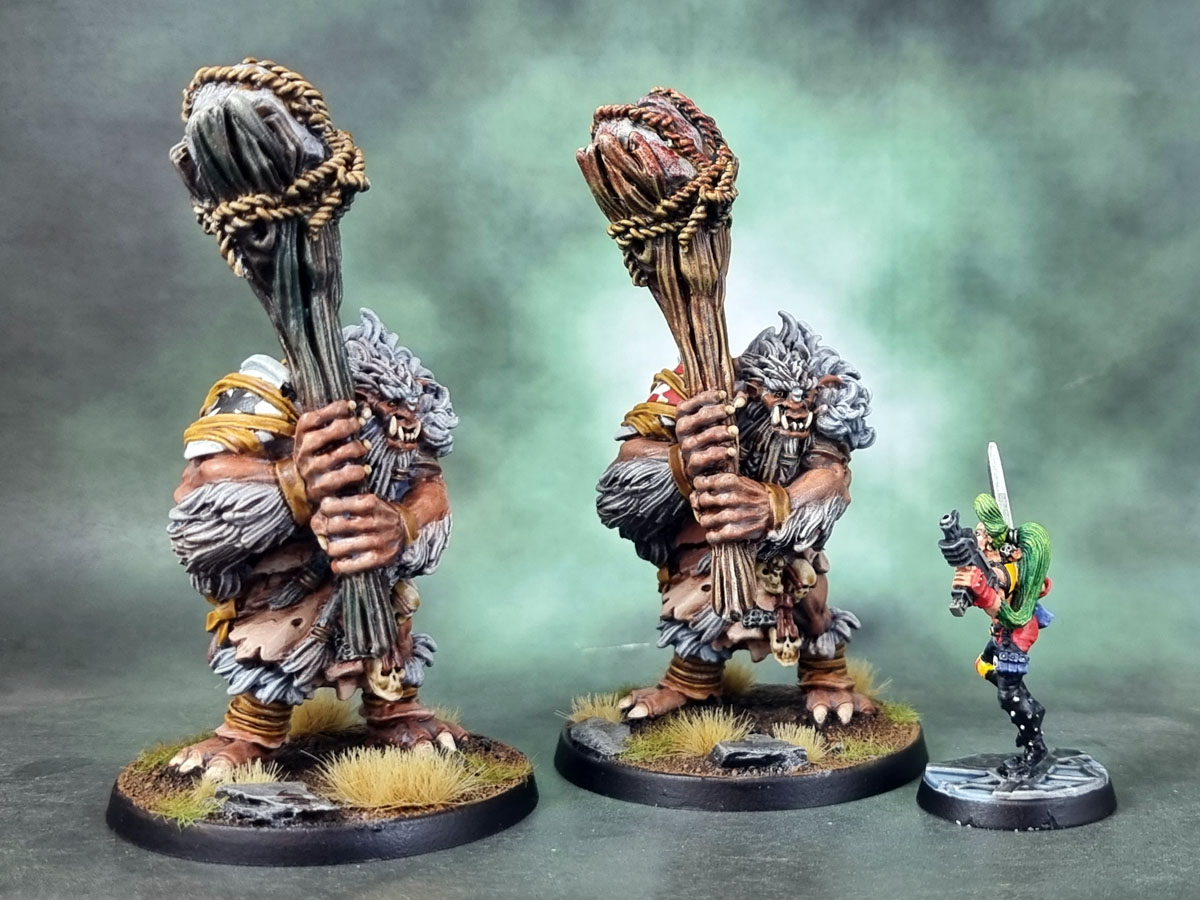
As you can see here, they’re some chunky bois. And as with many of the models that I don’t especially enjoy painting, I do like them a lot more now that they’re done. Unfortunately… there’s still another four of them :P. But that’s (hopefully!) where Monster MAYhem will come in handy…
Oh – and if you’re wondering why they’re not on snowy bases – simples! They’re not fighting next to where they live. They’ve come down the mountains to tag along with whichever army I drop them into (Ogres, probably) and raid the puny folk!