So as a complete Painting ADHD tangent, I’m trying to work out which way to go with painting my Chaos/Abyssal Dwarfs. I’ve (almost) always loved the look of these stunty little bastards, with the exception of the worst part of the “Byzantine Big Hat” phase (but I think a lot of that was from sub-par sculpting). But the “Oldhammer” WFB 3 (2?)originals, the second wave courtesy of Marauder, the modern re-interpretations by Forge World and even GW (Hellcannon) that tie the look of the originals and the “big hat” look together in a way that actually works. Alt-Manufacturers like Russian Alternative have some absolutely beautiful sculpts at surprisingly competitive prices. Even some of Mantic’s Abyssal Dwarves are decent (though most of those will be relegated out of the front rank of any units).
So this army will be a “Reward Army” – to reward myself for slogging through all the tedious Minas Tirith and Gondor figures that I’ve been working on. Not to mention ranks of Elves and Mantic Ogres that should have been finished long ago. Batch painting fantasy figures really doesn’t seem to agree with me. It’s like the last 20% of painting them is 80% of the work. Well, you know what it’s like when things are 80% finished for months at a time…
Note: None of the figures in this entry were painted by me. They were painted by a collection of other talented individuals. The images are included here as examples of inspirational (or not) colour schemes for my own forces.
There’s the traditional “Brass/Red/Black” type schemes, which look pretty good, but possibly shares a bit too much in common with Khorne (which is an army of mine that will definitely be coming later):


Then there’s the version that brings in a lot of blue as well, but I’m not too fond of this one. It’s a bit too 1990’s over-coloured (which, admittedly, is how my CD Bloodbowl team of those days looked. I just dug them out, I need to finish off those figures as well…) I know that the addition of blue (or green, or red) shading/highlighting is a traditional way to bring interest to black objects – rather than grey, but they just end up looking a bit too cartoony and technicolour to me. (Actually, my BB CDs look even more technicolour, and I’m wanting to avoid revisiting that kind of scheme).

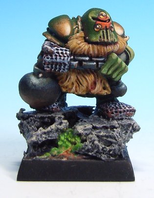
Even when it’s much more copper and less red (and more silver/iron), it’s still got a similar feel to the reddish. Despite the fact that these figures still look good, the scheme is still a bit boring to me. (Reddish metals give a similar feel to Red paint – whod’a thunk it?)
Then there’s green/metallic green armour – probably accented with warm metals like gold/brass/copper etc – and even a bit of red for spot colours as needed – I was always partial to this kind of colour scheme from the early WFB3 days:
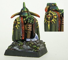
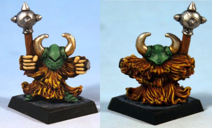
My only real concern with the green is that my Dark Elves/Twilight Kin are already using a Metallic Turquoise colour scheme (with gold/brass accents), going both into more blueish and more greenish, depending on the unit. I wanted to avoid the “traditional” purples and blues that DE always seem to be in. The Dwarfs would predominantly be in much more of a true, dark green than the shades approaching turquoise though. Similar to the guys above.
A third option is to use both green and red, and use the gold/brass/copper elements to tie them all together.
Any thoughts?