WAAAAGH! Pt.12: 40k Ork Slugga Boyz’ ‘Eavy Weapons

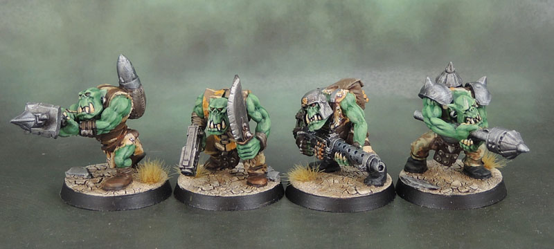
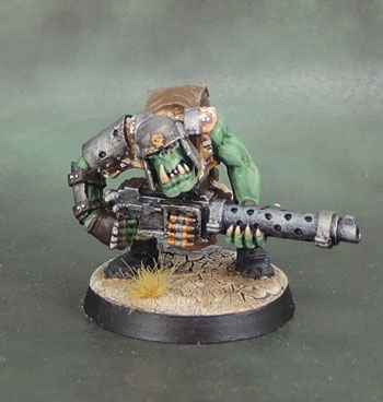
And now my final four Ork boyz – from the initial wave, anyway. The first of these is made mostly with fantasy parts armed with Slugga and Choppa. One metal boy with Big Shoota from before plastics were on offer – which is why I converted my others from the plastic boyz.

The other two are a pair of Rokkit Launcher boyz that are also kitbashed from plastic Ork parts with “rokkits” made from some Ork epic parts from the bits box. Their rokkit backpacks were made from greenstuff with some more plastic parts for the spare rokkits. The “rokkit arms” were initially made from fantasy spear arms.

Ork Slugga Boy

Ork Big Shoota Boy

Ork Rokkit Launcher Boy

Ork Rokkit Launcher Boy

While this is the last of the boyz from the first wave. We still need the two Nobz, the Warboss and a whole pile of grots/gretchin to properly complete the first wave – so still at least three posts (and a bunch more figures) to come…

Analysis paralysis: A Mantic BattleZones Bunker

Awhile ago, last year, and inspired by some terrain that Dakka user “Nerdfest” had built, I decided to dig out a bunch of my Mantic BattleZone sprues from their various Kickstarters that had been sitting untouched in storage tubs for years at this point, and make something. So over a rather enjoyable winter afternoon, I put together this bunker-thing. Being winter, there was little point even thinking about spraying it, so I let it sit, though the bare, grey plastic version did get used for a few 40k games.

Once summer rolled around, I gave it a spray. Dark Metallic Charcoal for the outside, and a sort-of undercoat of white for the interior. Now, I’m not sure where to go next with this thing. Broadly speaking, I can see three main options:

  1. Drybrush it various shades of metallic, for a rather generic finish.
  2. Paint it in military/generic “boring” tones that fit into quite a few different games. Military greens, or the more generic Greys or Tans. With or without things like signage or stancilled numbers and letters and so on and so forth.
  3. Paint it in “industrial/hive world” tones. Like the blue-grey from much of the original Necromunda card terrain. Or shades of green, or rusty reds, or…? Kinda like the above, but with more “pop” and of course, things like heavy rust and hazard stripes.

Even within those, there’s plenty of choice, though. So again: Analysis paralysis. Whatever the final verdict, I’ll probably put together a smaller building (4 squares) to go alongside this one and paint it in much the same scheme.

Anyone have any good ideas?