
Part Two then, of my Vikings. These figures were mostly completed in 2016. On the 14th of November if my record-keeping is accurate. Of course, I then realised that the horn-blower who wasn’t yet finished should really have a shield as well, and so completing the sextet went into painting limbo, since the horn-blower isn’t exactly my favourite model from the bunch. Since I had to paint a Viking shield for another model a few days ago, I did this one as well.
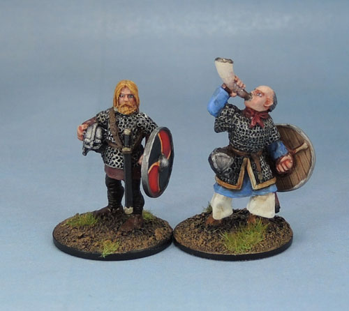
His mate in the picture above is one of the smaller figures amongst my metal Vikings, but he’s got a bearing to him, both in the pose and especially in the facial sculpt. Like he’s the sort of bloke you wouldn’t want to mess with. The horn-blower on the other hand looks like he has a big plum for a head, but the ruddy cheeks work for his pose.

Of course, now that I’ve finished it, I’m happy enough with the horn-blower’s shield. Simple, but neat and effective. I went with more muted yellows than I usually do, from almost white into an ochre, rather than orange.

Wargames Foundry VIK031 Gunwald Uggason & Viking
I believe that the larger of these two is a Viking Hearthguard model, and he’s a big chunk of metal. Since he’s chunky and quite well-geared, I gave him a deep red cloak to suggest wealth, and grey hair and a marked face to suggest that he’s both a veteran of many battles as well as (probably) some lucrative international bodyguarding duties. His friend here is painted in simpler, more muted and earthy tones. I tried to “streak” the paint in his shield to suggest a less wealthy origin. Damn, at this scale, the blown-up photographs really emphasise every flaw in the freehand shield painting. They look much neater and straighter at their actual size of 10mm or so.

Someone’s cloak is clearly much more expensive than someone else’s…
Wargames Foundry Viking, Gripping Beast SV01b Viking Warlord
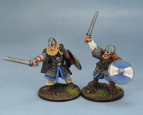
The final pair are amongst my very favourites of all my Viking models. I think these two are both by Foundry again – Edit – Turns out that Mr Gingerbeard here is actually a Gripping Beast figure, “Viking Warlord“. I’d had him pegged as a Foundry figure as his sword is very much the same as the Foundry models, and often the style of weapons on historicals can be a good clue as to which figures are from the same range, along with size and pose style, both of which fit in well again with the Foundry.
Ahem. Anyway, it’s the dynamic posing that really works on these for me. Not a lot more to say about these two. I like the models and I like the way they turned out with paint and their shields added.

These models, like the first half-dozen will be used for SAGA amongst other things. I’ve got a nice selection for my Hearthguard, and the others will make up a unit of Viking Warriors for the time being. I’m still short a model for a final warrior or my Warlord, so I’ll have to get some more done soon. I’ve just finished a few more Vikings, so once they’re dry and flocked I’ll have them up here as well. I can see a lot of the metals here being spread out amongst the plastics eventually to use as unit leaders.
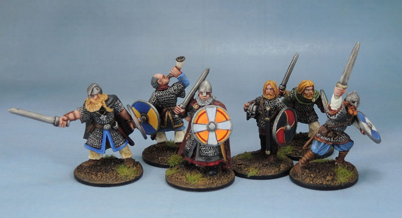
When I got to the second half-dozen of my Vikings, I’d decided much more consciously to paint the shields with a palette that complimented their bearers’ clothing and overall colour scheme. I’d been doing this to an extent with the first set, but I’ve been much more aware of it since then. A flaw in the way I used to paint years ago was trying to get too many colours onto my models, when a smaller palette with more variation of those colours works better for the models far more often.

These are all great mate and I couldn’t see any flaws.
LikeLiked by 2 people
It’s seeing lines that aren’t perfectly straight or of properly consistent thickness. They look fine in person, but blown up… You know how it is – you see every flaw in your own work.
LikeLiked by 1 person
True but I try not to be a perfectionist otherwise I’d get nothing done haha
LikeLiked by 1 person
Yep, at a certain point you have to just call things done. And then only go back and change them when it’s really needed.
LikeLiked by 1 person
Very nice – I love that they are all individual characters bit still have cohesion as a group, spot on mate 🙂
LikeLiked by 1 person
Thanks Alex. I’ve got one more Viking post coming up soon, then a bit of a break until I get more painted, and I’ve got other things distracting me right now…
LikeLiked by 1 person
Excellent work. I love the shield designs. The muted colours are a good match for these guys.
LikeLiked by 1 person
Thank you. As I’ve said, more muted and a bit more grubby would be more realistic, but I just can’t bring myself to do it on these ones. Maybe on the plastics…
LikeLike
Pingback: Vikings, þrjú! | Azazel's Bitz Box.
Pingback: Vikings, fjǫgur! | Azazel's Bitz Box.