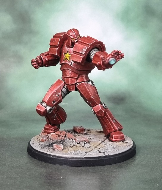
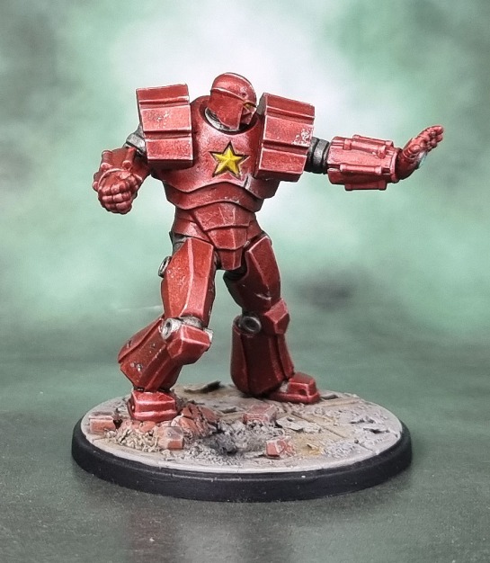
While I posted up Ursa Major from Marvel Crisis Protocol in the previous post, I did so because I wanted to keep the bears together, but he actually wasn’t the first of these models that I completed in January – that honor goes to The Crimson Dynamo! Why Crimson Dynamo, you may ask? (probably not, but let’s go with it…) Because Iron Man, of course! I want to ensure that I do a job that I’m happy with when I paint Iron Man (still WIP, this many weeks later) and so I wanted to see how well I could pull off the technique of using brush-applied Contrast Paints over a metallic base to try and get a nice metallic red final effect.
That meant I needed a guinea pig to see how it might turn out – and what better model to go with than Soviet Not-Iron Man wearing a repainted Darth Vader helmet?
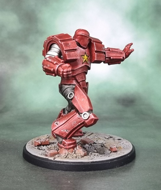
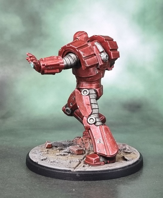
As you can see here, it worked well enough. It’s not the candy paint effect that Tony’s armour would have, but then I wasn’t quite going for the same thing – this is a slightly duller red (over silver rather than gold) and the highlights are using silver-added to Vallejo’s one of metallic reds. I used blue instead of yellow for his palm-blaster since I wanted a colour that would stand out, and the ARC-reactor/star on his chest is done with metallic yellow (hey Faust!) using yellow contrast over silver. Should that little round thing on his back be a glowy arc-reactor? I’ve seen it painted both ways at this point. I’ve also seen the circular joints on his knees and hips mostly painted red, but I liked how they looked as a plain steel (or titanium!), so I left them as they were.
In terms of the character, Crimson Dynamo is one I was aware of, though I haven’t read any stories featuring him. He’s basically 1r0n M4n: Soviet Edition from Teh Red-vengers because most of Iron Man’s arch-foes need to be bad dudes wearing similar armour with similar powers. An aspect absolutely unique to Iron Man.
Maybe.
So anyway, the sculpt has some damage and dings on his armour, so I went with those and also added a bit of paint chipping to his armour. I finished the base using some bricks clipped off some Mantic Terrain Crate brick walls and slate chips added to the base, since his tactical rock had a bit of brick wall on it anyway. A simple, but hopefully effective model, and another one done for Dave’s Paint what You Got challenge.

I hadn’t paid much attention to this miniature range before, but I have been enjoying the painting results on yours and other people’s blogs. I also came across a hobby store near me that stocks the range, so it may just be a matter of time before I pick some up.
LikeLiked by 4 people
Cheers Dave! A lot of them easily work just as nice display models even if you don’t really intend on playing the game. It’d be great to see what you come up with if you ever decide to paint any!
LikeLiked by 2 people
Thanks, the Sentinel box caught my eye on the shelf, I must admit, and they would look great on display!
LikeLiked by 2 people
Yeah – those are some impressive looking models! 🙂
LikeLiked by 1 person
Very nice! 🙂 Impressive looking armour! I like the pose of the figure as well!
LikeLiked by 2 people
Thanks John! I quite like this one all around too!
LikeLiked by 1 person
Excellent brushwork mate, and nice experiment with the contrast paint as well. Have you tried the GW gem paints to achieve the red on Ironman’s armour, I find two coats over silver works well, and you can add shade and highlights to the silver undercoat first before applying the gem paint.
LikeLiked by 2 people
I’ve done the main highlighting on the gold of Tony’s armour at this point, so it’s just a matter of adding the red over the top for a richer red than this bloke’s armour.
How have you found the gem paints over large surfaces? I’ve found them good for small aspects, but a bit hesitant on painting detailed models with such thick goopy paint.
Either way, I plan to then finish it with gloss varnish as opposed to the satin I used on Dynamo here.
LikeLiked by 1 person
I’ve used it on my sci-fi cars, so large areas, and found as long as you spread it evenly with the brush, no problems with streaking, just takes a few coats to get the depth I’m looking for, plus you can always add more highlights inbetween as well
LikeLiked by 1 person
Did you need to thin it at all, or just go for it?
LikeLiked by 1 person
Didn’t thin, just used the brush to spread it evenly
LikeLiked by 1 person
you can see my results here https://wargamesterrainworkshop.co.uk/product/sci-fi-sports-car-lamborrari-2000
hope this helps
LikeLiked by 1 person
I’d hoped to start this weekend but instead I got no models finished. Work is back with a vengeance along with work stress for endless things that need to be done now and for the second half of the year and then next year and onboarding new people and… 😮
So next weekend if the plan…
LikeLiked by 1 person
I love it.
LikeLiked by 2 people
Thanks IRO! 🙂
LikeLike
love the battle damaged look!
LikeLiked by 1 person
Cheers Eric! With all those dints and dents the model really called for it!
LikeLiked by 1 person
Nice- the contrast over silver worked well and I like the weathering.
Cheers,
Pete.
LikeLiked by 1 person
Thanks Pete! I am happy with how he turned out.
LikeLike
That is far and away the nicest “Crimson Dynamo” figure I’ve seen and you painting of it is really top notch mate!
Cheers Roger.
LikeLiked by 1 person
Thanks Roger! – is the small print that it’s also the *only* Crimson Dynamo figure you’ve seen…? 😉 😀
LikeLike
Very nicely done mate – just the right amount of wear and tear 😂
LikeLiked by 1 person
And that should’ve been a thumbs up 👍
LikeLiked by 1 person
Cheers Alex! Thank you. 🙂
LikeLiked by 1 person
Hey Azazel! Really nice job on this one and I think the Contrast Paints over metallics experiment really paid off. Makes me curious to see how your Iron Man turns out with a more candy-coated/gloss look. A side by side shot of the two would be pretty cool to see too! Stylistically, I think you made the perfect choice in not painting the metallic bits on the back as another Arc Reactor (that would be dead wrong to me!), and the knee caps look much better in red like you did them. I didn’t realize (and it’s hard to see on the mini) that they went with a more Vader looking face in this version. In the original design he looks much less Vader, but that’s not too say the artist didn’t take Vader’s helmet and make a lot of changes to it. But yea, that original revamp of the classic costume evolved quite a bit over time until you got what this mini was based off of. All in all, I think you really did the mini (and the character) justice. Even though I wasn’t crazy about this new costume design, I would be more than happy with the mini with the way you’ve painted it up. So you swayed me! 😀
LikeLiked by 1 person
Thanks mate! I’ve got a Zombie Iron man from the Marvel Zombie game to do as well, so I might start the Dave Stone technique on him and see how it turns out before moving onto the MCP model. I reckon it could look pretty sweet if it all works out, though.
I looked CD up and saw several of the suits over the years – this isn’t the one I was most familiar with, and amusingly even the official AMG artwork for this guy seems to show the helmet as a bit less vader than the sculpt, but it is what it is – no biggie to me.
Just the one left of these to go – and four left of the 10 from the core boxed set so I can feel like I can really start giving this game a go. Certainly looking forward to it!
LikeLiked by 1 person
Great painting love the weathering!
LikeLiked by 1 person
Thanks Guru! 🙂
LikeLiked by 1 person
Nice job on this one, mate! I think you painted this one effectively and smartly! The weathering on the armor really puts it over the top. You know if I painted it, I’d do NMM and it would take hours and hours 😉
LikeLiked by 1 person
Haha 🙂 I honestly prefer TMM over NMM. It can look great or even amazing when done well of course, but it’s just not something I prefer for my own style of model painting. I think it’s something that tends to look better on models when only viewed from one specific angle – which makes sense when you consider it’s a technique that evolved from 2d painting – so it often looks amazing in photos taken from that golden angle of the model but can be quite variable from other angles. 🙂
LikeLiked by 1 person
I probably have said this before but I like TMM but I think it is hard to get truly great photos with it. Before I went to NMM, I would paint miniatures in TMM and always feel like the photo let the miniature down. I probably could have done more to the metallic parts to help make it easier on my camera but that was the main inspiration for moving towards NMM.
So if you ever feel that way about your work, come to the dark side and try NMM. We have some great looking miniatures over here too 😀
LikeLiked by 1 person
I dont think it’s the TMM that lets the minis down in my photos – it’s the fact that i can never seem to get a nice perfect deep focus. There also seems to be an issue with the stanard lens on my S21 which probably doesn’t help…
NMM is one of those things that can look great, and I can appreciate the skill that goes into it, it’s just that by and large it’s not how I want my own models to look. 🙂
LikeLike
Very nice work, I’m big for contrast over metallics to get colours, I actually think yellow or brown contrast over silver give very nice gold and bronze. Did you do any work to the metallic first? I ask as I normally wash and drybrush before I add the colour, wondered what you had found best.
LikeLiked by 1 person
Yeah, my Minotaurs Space Marines use a similar/the same technique predating Contrasts – 2 coats of (the old) Seraphim Sepia over the silver metallic to create the bronze of their armour.
On Dynamo here I did pre-shade the iron/silver – both the parts that ended up red and the others that stayed iron. After reddening the armour, I then highlighted using Vallejo’s metallic red and then mixed in VMA Chrome into the red to highlight and gave the silver parts a final shade and highlight pass which was when i added the slightl browns, etc in.
LikeLiked by 1 person
That makes a lot of sense, thanks for sharing how you did it!
LikeLiked by 1 person
No worries at all! 🙂
LikeLike
Good work, and now you’ve really whetted my appetite for Iron Man. The additional base rubble really adds to the battle-damaged look too.
Crimson Dynamo is a lot of fun on the tabletop too; he generates loads of power and acts as a very nice ‘spoiler’ character by handing out Shock and forcing enemies to re-roll their successful attacks. He’s fitted in very nicely with the Criminal Syndicate for me.
LikeLiked by 1 person
Hope you enjoyed one or both of the IM models. I’ve still got the Hulbuster and extra Iron Man from that set, and I expect I’ll try another method of painting them again.
After finishing the last of the Winter Guard the other day,
I’m hoping to finish my Spider-Man model(s) this coming week so I might even be able to learn and give the game a playthrough. I’m pretty excited to get started. 🙂
LikeLike