
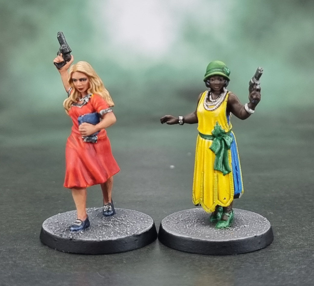
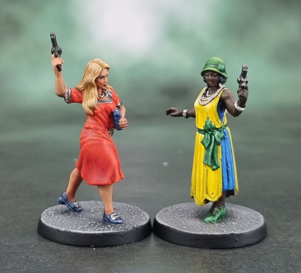
Today we have May’s (first?) pair of Death May Die investigators. First up, hailing from Caracas, Venezuela, Mary Diaz. (Think about that name for a moment or two… there’s something about it…)
Our second investigator comes from London, England, the Flapper, Elizabeth Ives. I wonder why Flappers haven’t made a comeback in the 2020’s? With piercings and tattoos and plugs, of course – I guess there’s still time… Speaking of time, I have no particular artwork or sculpt complaints about Mary, though Elizabeth is a different story…

For Mary I wanted to try a “light olive” complexion, as befitting both the artwork and her Latina heritage as well as the link to her clear inspiration making me go lighter. Along with that, the art suggested dark blonde hair, so I started from a darker base than usual. Her red dress has orangey highlights in the art, so again I tried to emulate those on the model.
Elizabeth’s art is generally fine, though the colour choices (bright yellow with blue and green!) aren’t exactly what I’d have chosen. Still, with all but one of these models (to come sometime later) I do intend to stick with the artwork reasonably closely. No, the problem with Elizabeth was with the digital sculpting – her pearl necklace & bracelet as well as her facial details were clearly sculpted with an artists’ PC screen and large renders in mind rather than an end-painter – so they suffer from being very fine and shallow. I mean – I like to do a good job on these, but I’m no Angel Giraldez, nor am I willing to invest hours into detailing the pearls on this model.
Still, I’m happy enough with the end result – not sure what that dot on Elizabeth’s dress is – I’m just seeing it for the first time now, so I’ll go and check it out a bit later – hopefully it’s just a bit of fluff stuck to the model (along with that hair!) 😮

Great work on both Az
LikeLiked by 2 people
Thanks Guru! 🙂
LikeLike
Two very different figures! I really like them! 🙂
LikeLiked by 2 people
Cheers John – the next pair of these share a theme when I get to painting them. 🙂
LikeLiked by 1 person
You’ve done a fantastic job on both mate, even with the strange colour choices they went with, you’ve given them both life. I know what you mean about 3D sculpts and shallow detail, hopefully one day they will learn to define better, we can but hope ! LOL
LikeLiked by 1 person
Yeah, it does seem to be down to individual sculptors and – I guess – their experience with miniatures. Gigging 3D sculptors who have never touched a paintbrush and only see what high end studios do with their work with promo commissions will likely take a lot longer to “get it” than those who have more to do with the full process.
LikeLiked by 1 person
Lovely job mate, really nice work on the fabric!!
LikeLiked by 1 person
Thanks Alex!
LikeLiked by 1 person
I think they both came out well. It seems like less is more with these more mundane miniatures too which is not something I would have thought but it makes it easier on the painter. I’m with you on the bright yellow and green colors. It seems a little out of place with the historical setting though I’m no expert. She’ll certainly be easy to find on the tabletop which is not a bad thing!
LikeLiked by 1 person
I’ve honestly got no idea on the colours. I mean, all the stuff we see on 1920’s clothing seems a lot more muted, with much more blacks and whites, but then again, all the photography is also in B&W so I don’t know how many previously coloured outfits have just turned into shades of grey over the past century…
LikeLiked by 1 person
I couldn’t agree more, mate and its like you took the thoughts right out of my head. Maybe they’re leaning into the pulp setting with the color choices!
LikeLiked by 1 person
This one is certainly the most out-there of the models I’ve looked into so far! 😮
LikeLike
Excellent work on Mary! I think you’ve been really successful with all the main elements – face, hair and the dress! She looks very feminine.
LikeLiked by 1 person
Thank you. I feel that I’m still learning when it comes to hair and I’m certainly being cautious on how far to push the contrast there without making it look unrealstic.
LikeLike
Really nice job. Especially the face and hair on Mary! I didn’t realize she was latinx at first, but the skin tone turned out good. I remember a few women in the 00s who were sporting something like the flapper dresses and hats. Maybe was around the time when thrift shopping started to become popular/fashionable.
LikeLiked by 1 person
Thanks Faust – Mary’s skin tone comes across a little more when she’s next to some of the whiter characters. I admit that sharing Mary next to dark-skinned Elizabeth does more to hide her tone then to highlight it, but these were simply the two ladies I happened to be working on together!
LikeLiked by 1 person
Great painting as always. I think that the yellows, blues and greens work really well on Elizabeth. May she party for untold eons!
LikeLiked by 1 person
Thanks mate! We’re about to wrap the D&D game so we can play some more Cthulhu DMD again shortly! 🙂
LikeLike