Star Wars Imperial Assault: Jabba The Hutt (Jewel of July ’19)

Star Wars Imperial Assault Jabba The Hutt

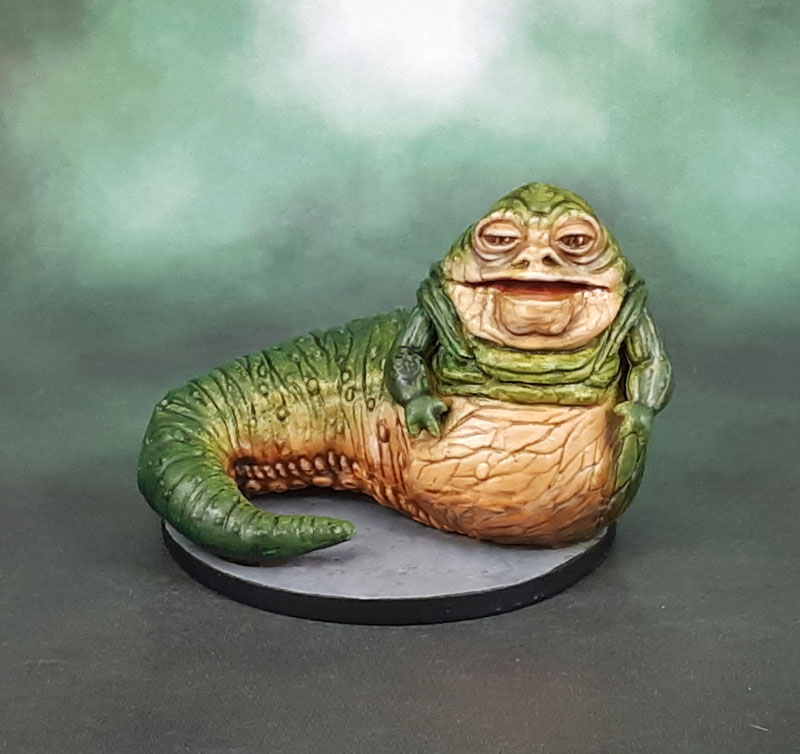
Ahhhh Jabba the Hutt. A character that goes back to my childhood, the excitement of seeing previews of Return of the Jedi and then finally seeing it in the cinema. So when I started to expand my Imperial Assault collection, how could I skip the most notorious crimelord of Tattooine?

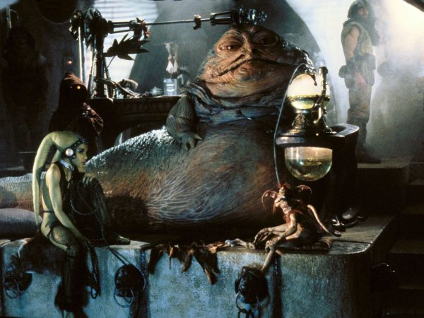
One thing that was never apparent for many, many years was the fact that a lot of Jabba is actually green. Why? Well, when seen in the film, he’s always in dim surroundings and the main angles that he’s lit and filmed from highlight his sandy-yellow coloured face and underside. The “green” areas always looked to me like they were prdominantly a shadowed effect.

This was further reinforced by the oringinal Kenner toy. I never had it myself as a kid, but a friend did, and the thing was basically desert yellow in its entirety.

So then the remastered, butchered “Special Edition” Original Trilogy films came out, and what the actual fuck was going on here? Unconvinging, cartoony-faced CGI, a vastly smaller Jabba, a silly “comedy” spot where Han steps on Jabba tail, and much more green, to boot! Messed up on a variety of levels to the point where it looked (to me) like they’d just changed Jabba’s colour. In the same way that they changed his face, his size… you get the idea.

Star Wars Imperial Assault Jabba The Hutt

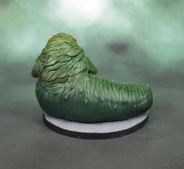
So it wasn’t until years later – sometime after the Internet became a thing I spent time on – when I finally saw and understood that Jabba was in fact, actually mostly green the entire time. So.. okay. So then that was how I finally painted the model, despite my instincts wanting to make him entirely made up of shades of yellow, tan and ochre. Finally complete (he’s a Neglected one, too!) It’s a pretty nice model, though it does have a few flaws.

Star Wars Imperial Assault Jabba The Hutt

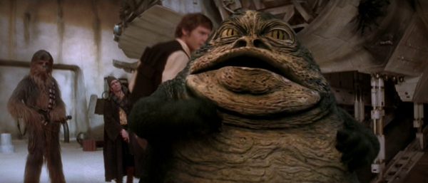
So wild tangent aside, the main flaw with the model is basically the size. As you can see from this triad of “Scum and Villany” types, the scale used by FFG for Imeprial Assault is one that gives a lot of priority for the models being boardgame pieces first, and miniatures a (distant) second. People familiar with Star Wars will know that the droid, IG-88 is super tall, the Jawa is tiny, and Jabba is a huge, bulky slug. For scale, Jabba should be so big that the Jawa is about the size of Salcious Crumb (the bird-faced fellow sitting under his bong in the above film still).

Ah well, boardgame miniatures, eh? Whaddayagonnado?

Shadows of Brimstone: Dark Stone Brutes + Contrast Paint Experiment #4

Shadows of Brimstone Dark Stone Brutes

Today we have a few more Shadows of Brimstone models. These aren’t good models, though. In fact, they’re some of the models that gave Brimstone’s first releases such a …mixed-to-poor reputation, despite being made of “proper” HIPS plastic. But yeah, these make models like the Feral Kin/Werewolves look positively amazing, depite those also being low-detail models that only go together one way. As with a great many of the Brimstone models I’ve painted to date, they did get pulled from the big box of sprues in plastic baggies was because they looked like they’d be “easy wins” – models that would be straightforward and uncomplicated – in other words, easy to paint.

Shadows of Brimstone Dark Stone Brutes

As it turned out, they looked even worse than I expected once I had them clipped and then glued. really soft detail all around. So they sat there for.. quite awhile. Then, the Contrast Paints arrived, and I knew I had the perfect way to get these things the hell off my desk – seeing how they work on what are basically, soft-detail models that are bad from a technical point of view, completely aside from their aesthetic aspects. I originally planned to paint their “rock” sides as yellowish stone, in homage to The ever-lovin, blue-eyed Thing, but after referencing the box art and some other people’s painted models, I decided on the greenish grey in the Contrast Range instead.

Now, I’m no slave to Box Art, but these aren’t figures I care about, so im’a (is that how you spell it?) “save” Ben Grimm for a figure I can give a shit about. As opposed to just looking like shit. Besides, they’re called Dark Stone Brutes, so… whatever. So I used three different Contrast paints for their trousers, three others for their shirts, Guilliman Flesh for their faces, and Gryph-Charger Grey for their “rocks”. Then a bit of drybrushing and the tiniest bit of normal painting to finish the face, eyes, hair and hands.

The Warpstone or whatever it is is Greenstuff World’s Colour-Shift green because I forgot the colour I used last time on the Hydra, and thought it was green rather than purple. They’re shaded with purple, but again – whatever.

Shadows of Brimstone Dark Stone Brutes

But Azazel? Surely the detail on these models isn’t that bad? Well, here’s a size comparison for you. They’re pretty solidly big. You can see how they stack up for size compared to a normal Space Marine, a Primaris and a normal Human (Hasslefree).

So what does this show? Well, most obviously, Contrast Paints can help you get models painted quickly and in many cases look pretty good, but on poor quality models, they’ll do nothing more than speed the painting up. I mean, this is what I expected anyway because my view of these paints has been as simply another tool the entire time.

Now, could I – or anyone else who is willing to put the time in make these look amazing via putting in a lot of time with traditional methods and added freehand? Of course! But the fact is that in that case you can make a post-it note look amazing, or an egg. Or.. well, you get the idea. I get it that there are people out there who want to really put their best efforts into each and every model that they paint. I get it. That used to be me, too. Now, a decade or three on, and with an ever-expanding number of models to paint, I see the folly in that attitude – at least for me (and because I keep buying models!)

So now it’s more of a Triage situation. Models like these only get painted because they’re for a game I actually want to play, and they’re multiparts, so they need to be assembled, if not painted. So a quick and dirty paintjob is what the shitty models get because they’re not worth my (limited) time to care about all that much. These only got bumped up because I was curious about using Contrast on them, and wanting to see how the actual colours of them with my own eye, as well as a little more experience in applying them before I get to models I might care about. By these metrics, these Sow’s Ears that still look nothing like Silk Purses are a success.

They still look pretty shit, though. The only thing I actually like are the desert bases!