

Today we have a few more Shadows of Brimstone models. These aren’t good models, though. In fact, they’re some of the models that gave Brimstone’s first releases such a …mixed-to-poor reputation, despite being made of “proper” HIPS plastic. But yeah, these make models like the Feral Kin/Werewolves look positively amazing, depite those also being low-detail models that only go together one way. As with a great many of the Brimstone models I’ve painted to date, they did get pulled from the big box of sprues in plastic baggies was because they looked like they’d be “easy wins” – models that would be straightforward and uncomplicated – in other words, easy to paint.
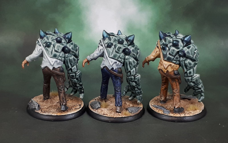
As it turned out, they looked even worse than I expected once I had them clipped and then glued. really soft detail all around. So they sat there for.. quite awhile. Then, the Contrast Paints arrived, and I knew I had the perfect way to get these things the hell off my desk – seeing how they work on what are basically, soft-detail models that are bad from a technical point of view, completely aside from their aesthetic aspects. I originally planned to paint their “rock” sides as yellowish stone, in homage to The ever-lovin, blue-eyed Thing, but after referencing the box art and some other people’s painted models, I decided on the greenish grey in the Contrast Range instead.
Now, I’m no slave to Box Art, but these aren’t figures I care about, so im’a (is that how you spell it?) “save” Ben Grimm for a figure I can give a shit about. As opposed to just looking like shit. Besides, they’re called Dark Stone Brutes, so… whatever. So I used three different Contrast paints for their trousers, three others for their shirts, Guilliman Flesh for their faces, and Gryph-Charger Grey for their “rocks”. Then a bit of drybrushing and the tiniest bit of normal painting to finish the face, eyes, hair and hands.
The Warpstone or whatever it is is Greenstuff World’s Colour-Shift green because I forgot the colour I used last time on the Hydra, and thought it was green rather than purple. They’re shaded with purple, but again – whatever.

But Azazel? Surely the detail on these models isn’t that bad? Well, here’s a size comparison for you. They’re pretty solidly big. You can see how they stack up for size compared to a normal Space Marine, a Primaris and a normal Human (Hasslefree).
So what does this show? Well, most obviously, Contrast Paints can help you get models painted quickly and in many cases look pretty good, but on poor quality models, they’ll do nothing more than speed the painting up. I mean, this is what I expected anyway because my view of these paints has been as simply another tool the entire time.
Now, could I – or anyone else who is willing to put the time in make these look amazing via putting in a lot of time with traditional methods and added freehand? Of course! But the fact is that in that case you can make a post-it note look amazing, or an egg. Or.. well, you get the idea. I get it that there are people out there who want to really put their best efforts into each and every model that they paint. I get it. That used to be me, too. Now, a decade or three on, and with an ever-expanding number of models to paint, I see the folly in that attitude – at least for me (and because I keep buying models!)
So now it’s more of a Triage situation. Models like these only get painted because they’re for a game I actually want to play, and they’re multiparts, so they need to be assembled, if not painted. So a quick and dirty paintjob is what the shitty models get because they’re not worth my (limited) time to care about all that much. These only got bumped up because I was curious about using Contrast on them, and wanting to see how the actual colours of them with my own eye, as well as a little more experience in applying them before I get to models I might care about. By these metrics, these Sow’s Ears that still look nothing like Silk Purses are a success.
They still look pretty shit, though. The only thing I actually like are the desert bases!

A couple of times this year I found myself obliged through by inability to say no to paint a dozen or so figures for someone else. Ordinarily I don’t mind doing someone a favour but the figures and lack of detail were complete shit which presented a challenge I could have well done without. In the end, much like your experience here, they were OK but I feel your pain of doing something you cannot really be arsed to do.
LikeLiked by 3 people
Yep. If not for the mental excuse of trying out how some of these new paints look in hand, these would have continued to sit in a plastic tub for an indeterminate amount of time…
LikeLiked by 3 people
Well, on the plus side for you, you got through a contrast painting experiment and I think they look OK! Funnily enough though, I don’t actually care all that much for the basic figure as it’s been realised, which is the first time I’ve thought that about any of the Shadows of Brimstone models. I think it’s the stone one side and normal clothes on the other side that make them look odd to my eyes. Anyway, well done on getting them done! 🙂
LikeLiked by 3 people
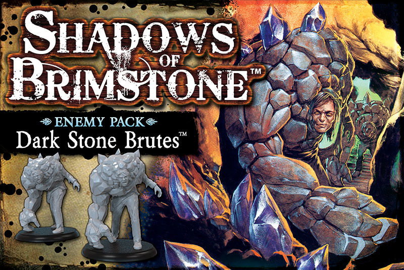
Oh, I agree. The character design is as bad as the model design on these. I didn’t actually buy these as a deliberate purchase, though – they were part of the (huge) haul of Kickstarter stretch goals.
LikeLiked by 3 people
Ah, done now, and not too bad all things considered 😊
LikeLiked by 2 people
As tabletop boardgame mooks, they’re perfectly sevicable. I’m happy enough with that!
LikeLiked by 2 people
Goodness me, those are certainly some blobs of plastic, aren’t they! Well done for powering through to finish them, and thanks for showing off the contrast paints for those of us who haven’t yet taken the plunge.
LikeLiked by 3 people
All good mate, I think paint experiment/experience models are their best use. Well, using them in the actual game might also justify the time spent on them. We’ll have to wait and see!
LikeLiked by 1 person
Good use of these uninspiring models to try out the new paints and get them off the table, shame really as they could have done some really inspiring models with the subject material
LikeLiked by 2 people
Yeah, their first run with the original game certainly got them a lot of criticism for many of the models which they’ve hopefully taken to heart. The renders shown for some of the models for the newer campaigns certainly look a lot better than the line art we got for these!
LikeLiked by 2 people
Yeah, those are some very uninspiring models. Well done for sticking with them though, and you’ve made a good job of them despite their failings. It’s always a hard balance to strike with models like that, you don’t want to beat your head against a brick wall but at the same time you don’t want to compound your dislike of the model by giving it a paint job you’re not happy with. Think you did a grand job here though.
LikeLiked by 3 people
Yeah, it’s the ever-present juggling of the balance between looking good enough and time to finish. I think, based on these sculpts, I put enough time in. 😀
They’d have been more work to carefully drybrush up than using the Contrast (because fuck blending *these*!), so it was a good use of them to actually get rid of these from the desk!
LikeLiked by 3 people
They did come out looking much better than they could have, for sure. Nice use of the Contrast and colour-shift paints to get a bit more out of a fairly boring base Model.
They are a cool concept, but yeah, awful casts, and the sculpts don’t really convey any impression of how they got like this. It’s like they just suddenly had half of them replaced with rock troll parts, rather than something where you can see how they warped and bulged into their current form.
I think I might have mixed up the stone colours a bit more, tho. Particularly on the two with bluish shirts, it’s similar enough to the shirt colour that it exacerbates the poor definition of the sculpt/cast and makes it harder to tell what’s going on.
And yeah, Ben Grimm deserves better. Actually, come to think of it, that’s a pretty general statement. Dude’s been dealt some pretty bad hands over the years. Since it’s not actually proper English, I don’t think there is a specific correct spelling for Im’a. I’ve seen that, Imma, I’ma, I’mma, and I’m a’ in various places.
LikeLiked by 3 people
I might have mixed the colours more, but really, I didn’t (and still don’t) care enough. As shitty as these figures look here, they’re even more shitty when you’re painting them! 😀
Looking at it rationally, it probably would have been an ok time to experiment with mixing the contrasts for different tones as you suggest, but then, I’ve got poxwalkers for that – and they’re a hell of a lot more fun!
LikeLiked by 2 people
How are you finding the contrast paints generally? Would you recommend them?
LikeLiked by 2 people
I would definately. I’m still learning how to use them (and how to NOT use them) with a bit of trial and error, but yeah. I can see them becoming a permanent tool in my repertoire for all sorts of things.
I haven’t used all of the colours yet. I’ve started some poxwalkers to get in some play with flesh tones, pinks, purples and greens, but they’re definately working for me. Just be sure to have medium on hand to help with transitions and thinning down the pigment where needed.
LikeLiked by 3 people
First, I am a big fan of trying new things. You will see that in my next post, with results that are mixed. That’s experimentation, but the next iterations are hopefully better for us. The castings I make of old figs sometimes have something lacking as well – the challenge is to make something better than what you started with (at least for me). I have some contrast paints but they are not terribly suited to recent projects – I have some plans to try them soon. For the record, I think these are fine for gaming and you did well enough with them.
LikeLiked by 4 people
Absolutely in agreement there, Mark on the value of experiments and considered “risks”. I got what I wanted from these models, so while they may well look a bit crap, they’re still a success from my perspective. In my developing experience, the Contrast Paints are mose effective on organic surfaces, followed by rough inorganic ones. Still, I know that will vary when I get to trying out Apothecary White on a Space Marine Apothecary (Field Medic), as the amount and strength of pigment in them seems to vary accoring to the colour and the intended use.
LikeLiked by 1 person
Very helpful advice on the Contrast Paints – that will be my initial rule of thumb…when I get to them!
LikeLiked by 1 person
Doing some mucking about with then on some sci-fi cats (of a sort) tonight… seems to work well. Once again especially since I was not super keen to paint them using the traditional methods.
LikeLiked by 1 person
Blimey! Those are some poor sculpts. I think the idea of throwing half-human features and half-rock features just doesn’t work well. The faces on them look especially odd and also creates a really top-heavy mini. I can see exactly what you mean about some of the poorer Shadows of Brimstone models now too! Good job knocking these out and I think you’ve made them look a lot nicer than they have any right to be.
LikeLiked by 2 people
They’re pretty bad. More importantly, they’re done and I won’t have to look at them anytime soon. At least after I do my round-up, anyway! 😉
LikeLiked by 2 people