
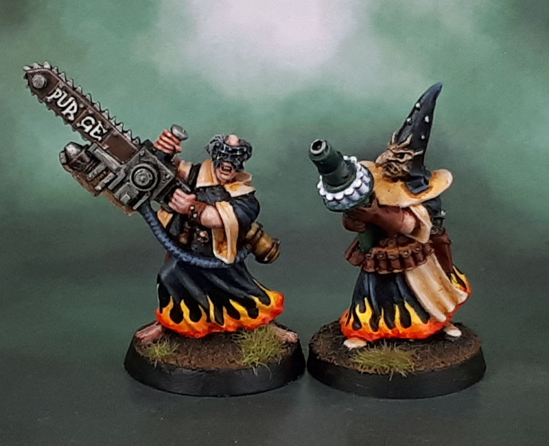
Getting sick of seeing Necromunda models of robed and hooded religious maniacs yet? If so, that’s a shame because we’re not quite finished yet. There’s also a few types of method behind my posting patterns – there’s breaking up similar models (like Cawdor and Redemptionists) into distinct posts which makes it easier when people GIS search for different models – especially older ones. It also let me get more posts up – which can be more work but it does (often) help with my own motivation in getting more models painted – and then of course there’s posting stuff as I get them finished – which often ties into that previous point.Anyway, this pair of Redemptionists are also Gary Morley sculpts, and once again they’re models that I really do like.
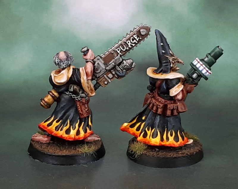
I’ve (obviously) continued with the flame motif, and the Redemptionist with Eviscerator owes a debt to mcmatilla’s Preacher with Eviscerator. After seeing his work, I knew I had to add some text to the ridiculous chainblade. May they slay the Emperor’s foes together in his glorious name! It was pretty satisfying to finish this pair after more than a decade half-painted as well, and as such I’ll throw them in for Ann’s “Paint the Crap You Already Own!” challenge as well.

Yet more fun stuff – thanks for sharing – I really like the chains saw and the hand painted “purge”. How do you get the letters to be so crisp?
LikeLiked by 6 people
Thanks Mark! On these I painted the text in a thicker black, then went over it in a thinner white. This allowed me to go over the edges of the white to sharpen it when needed, as well as redo either as needed to get the final effect.
LikeLiked by 3 people
Superb.
LikeLiked by 4 people
Thank you, TIM!
LikeLiked by 1 person
Never getting tired of them religious fanatics!
Ah, so the chainsaw guy is a Necromunda model! I ran into him on eBay when looking for my preacher, and didn’t recognise him at the time. You’ve done a great job on him, and the white text looks awesome on the rusty blade. I envy your lettering – there’s an actual style to it, versus my basic block letters! And you did it twice!
LikeLiked by 5 people
Thanks! The Redemptionists and Preachers cross over pretty easily, though this guy does admittedly lack shoes. I’m still a little annoyed at the lettering to tell you the truth – going around those bloody rivets meant i had to compromise what I wanted from the text style pretty badly. But then I didn’t want to carve them off, either – so this is what we get. Still, without having seen yours, the blade would have been left plain – so credit to your work there! 🙂
LikeLike
Nice work once again! Gary Morley gets a lot of stick, but there’s so many of his models that I like, including these.
LikeLiked by 4 people
Thanks Dave – and I agree. Sadly for Gary, Nagash is the curse that never seems to fade. (Yet the Perrys did the plastic Catachans and noone says anything untowards about their skills!)
LikeLiked by 1 person
Lovely! 🔥😎
LikeLiked by 4 people
Cheres, Alex!
LikeLiked by 1 person
Excellent work mate, fits in great with the previous two, and awesome crisp lettering
LikeLiked by 5 people
Thanks Dave – and glad you like them! 🙂
LikeLike
They look positively nasty.
LikeLiked by 5 people
Nasty on the outside, ugly on the inside….
LikeLiked by 1 person
Brilliant! I do like these! 🙂 I maybe need to move on to having armies where Eviscerators are standard issue kit!
LikeLiked by 5 people
Ha! I think maybe the Sisters have some units who qualify?
LikeLiked by 1 person
Nicely done. I like the contrast of bright and dark colors on the models., and I particularly like the hem flames.
LikeLiked by 5 people
Thanks Ann. I know that the (generally) bright and (generally) clean lights and darks I use don’t make for particularly realistic looking models, I like the striking effect that they tend to have on the shelf or the table, and it carries well from a normal viewing distance without the figures looking too muddy.
LikeLiked by 1 person
I also often think about how miniatures will look at tabletop distances as well and try to make that my focus too. Besides, especially for “heroically” proportioned miniatures carrying impossibly large weapons and so on, I don’t think that realism is really essential or necessarily even desirable. The aesthetic you’ve been presenting with your miniatures certainly works well for my tastes at least. 🙂
LikeLiked by 1 person
Yeah, every so often I consider getting a somewhat converted model and adding a hint of fleshtone around the head and hands and then mostly just drybrushing it a series of rough shades of grey to fit in with all the “grimdark” painters out there that get so much acclaim. If only to see what the reaction is.. 😀
LikeLike
They make for a lovely, if homicidal, pair.
Cheers,
Pete.
LikeLiked by 4 people
Homicidal, genocidal, fraticidal!
LikeLiked by 1 person
I’m with Mark, how do you get those letters looking so good?
Excellent stuff mate.
LikeLiked by 4 people
Thanks mate – I wrote it up in responce to Mark’s comment. Hopefully it helps a little? 🙂
LikeLiked by 1 person
Not at all tired of seeing these awesome minis! These two might be even more fierce than the previous two 😀 I love the chainsaw and that guy’s expression. You can tell he enjoys carving things up haha! Great paintwork as usual and I’d love to see the squad altogether when you have them finished as I imagine they will look really cool together.
LikeLiked by 2 people
Thanks Kuribo. I’ll deffo have a few group shots of them set up in the near future. Despite taking so long to get to the finish, I always did enjoy painting these lines of models.
LikeLiked by 1 person
Still great looking sculpts after all these years! Love your paint job on these guys as well.
LikeLiked by 2 people
Thanks Mate! They certainly still are and I appreciate the kind words. 🙂
LikeLiked by 1 person
Pingback: April 2020 “Paint the Crap You Already Own!” Painting Challenge Round-up (Part 1 of 2) | Ann's Immaterium