
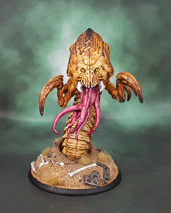
Another of the larger-but-simpler models from Shadows of Brimstone today. It’s the Wasteland Terralisk! Unlike, well, quite a lot of the other original Brimstone models, this one is not bad at all. (You should see the trio of garbage Brimstone models I just finished! – Well, you will after I finish June’s stuff…)

The other thing of note is that this one is painted largely with GW’s new Contrast Paints. The model is really in four main painting “Sectors”, which made it ideal for playing with Contrast. The tentacle-tongue, the soft(?) underbelly, the carapace & claws, and finally the base.

The base was painted in the traiditional manner, with a coat of sand for texture, since the sculpted texture was weaksauce, so don’t worry about that. The Tongue was Super Easy, Barely an Inconvenience. One coat of Contrast Volupus Pink over Wraithbone Primer, and that was it! Perhaps not quite as nice as if I’d used my normal techniques, but for something like a tentacle-tongue, well, this isn’t a mile off what I might try, and it was much, much faster! The Underbelly was done with Contrast Aggaros Dunes – and again just a matter of painting the stuff on initially. After it was fully dry, I gave it a light drybrush with a sandy ochre colour.

The carapace, face and widdle claw-arms were similarly done with Contrast Snakebite Leather over the Wraithbone primer. I first darkened the tips of the claws before applying the contrast. For the face, I painted the “skull-face” section with Contrast Medium first, and then bleneded the Snakebite Leather down into it. I did this in order to preserve the skull face and have it be a bit lighter, to keep it as the focal point of the model. Once the Snakebite Leather had dried, I drybrushed all of those areas with a very pale sand/off-white colour. Following that, I went and re-darkened the tips of the claws as well as the spiniest part of the back carapace by carefully drybrushing with black. Teeth and Eyes I painted in the traditional manner.

I only took colour inspiration from the box art in the most coincidental way this time. This was because KS backers didn’t get a box (we got a sprue in a plastic baggie) and because I didn’t look for the artwork as I wanted to play with the Contrast Paints once I finally pulled my finger out and started painting it. (It’d been assembled and primed for …fucking ages.) Good thing, too, since the artwork colours are …rather basic.
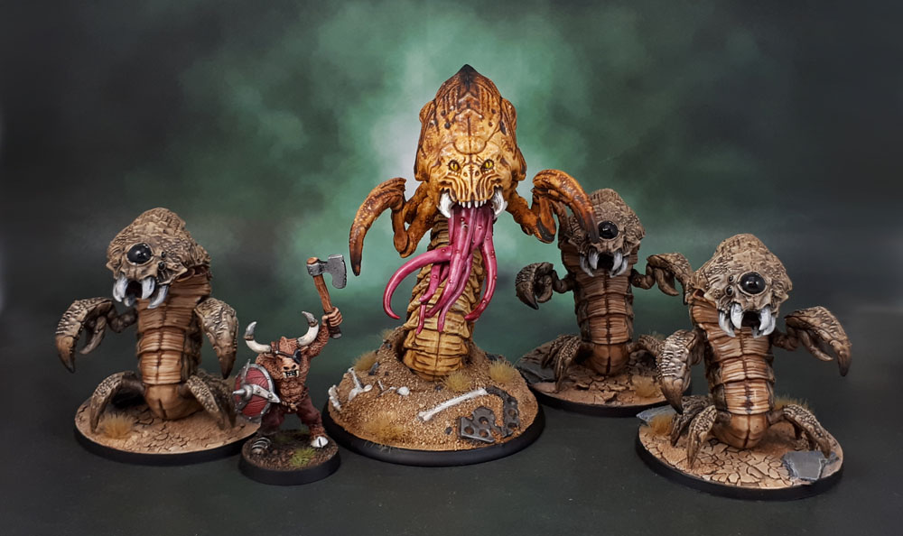
Scale Shot Provides Scale.
I took some video with my phone of the process, though I’m not sure if I can be arsed editing it together, cringing at my own voice, or posting it up on the You Tubes, but either way, the text here tells the story ina reasonable manner. Ultimately, the Contrast paints worked really well on this model, one that is entirely organic shapes with decent enough detail. On models like this (and stuff like dinosaurs, etc) these paints will really shine. Could I have done better painting tradtionally? Sure, I really think I could have. Would I have bothered? I honestly can’t say if I’d have put enough effort in to do so, though. Being completely honest, this model had already sat for more than 6 months with no movement, but the Contrast Paints’ arrival were what got me motivated to get the model painted. Sure, being a test subject was part of that – but so was “I wonder how fast I can paint that sucker and still have it come out decent”. With these paints, the mst painful part of the model was the base!

Cool mini, good use of the contrast paints and a nice group of buggy goodness. The face of the beast reminds me a bit of predator.
LikeLiked by 3 people
Thanks, D&B. I’m still very much in the learning stage of using these paints, but I can see a lot of use integrating them into the painting of organic models (as well as speed painting garbage models) 😉
Those side-teeth really do have an echo of the Predator’s mandibles, now that you point it out…
LikeLike
Nice piece. Haven’t tried contrast paints yet but you are getting good results so might have to take a closer look at some point.
LikeLiked by 3 people
I can see them being a very useful tool to integrate into my painting. Learning which colours of the paints work well for which needs and model types is going to be a bit of an adventure, but I’ll be sure and keep showing them here!
LikeLiked by 1 person
Hmm tempted to try the contrasts. Nice work man
LikeLiked by 3 people
I’m enjoying them so far. I’d say picking up a few would be worth it to play with them if you’re tempted.
LikeLiked by 1 person
Yeah I reckon I might just do that. Hey did you see the Jewel of July Submission from me?
LikeLiked by 1 person
Yeah I did. I had to go check your blog yesterday to double-check. I saw it on my phone while at the Physio, along with Alex’ Generators, so they’re both in my backlog to look at again and comment on. 🙂
LikeLike
Very impressed with your use of the contrast paints. I bought a few at a couple of widely dispersed hobby stores (in advance of a few upcoming projects), and noted that they were mostly out of stock. Asked the managers, and got the same answers, basically they could get more if they were willing to pay GW up to double the price. Whatever else GW is, they know how to market – and they do make nice paints.
Nice work on this, GW should hire you! Or at least the figure manufacturer should use your image on the box!
LikeLiked by 3 people
Ha! Well the bar is so low on that box art that I could have spilled the pot on my desk and it’d still look better I think. 😉
I read earlier today that the Contrast Paints have been their best sellers for many years and really blown June’s sale up – even outselling 8th edition 40k (which was a huge release month).
The browns have all seemed quite good so far, and Creed Camo and Militarium Green might also work for you.
I’ve saved these images and have been using them as a kind of “digital chit” to help me choose which colours to experiment with.
ooh! updated chits with more base colours!
https://www.dakkadakka.com/dakkaforum/posts/list/1590/774546.page#10482099
LikeLiked by 1 person
Good job on the painting, but I’m still not liking GW Contrast paints. Maybe if you dull coated the mini, but the finished model looks way too shiny for my tastes. Not to mention that you still had to dry brush to get the required edge effects.
My opinion is that these paints are great for beginners or for painting large amounts of “wound counter” models. Since I’ve switch to playing/building skirmish style games, I like to take my time with each model and paint it to the highest standard I can do.
LikeLiked by 1 person
Shiny/Not shiny has nothing to do with contrast paints and everything to do with the varnish I (you, whoever) use. All my models get varnished to protect them from handling, and Contrast Paint models need it especially. This model has been given a coat of satin at the end, which is what you can see here. With three diffused lights aimed at the model plus ambient lights, you get shine where in-hand it looks normal. (This can apply to anything I show here – not just this thing.)
As for that these paints are good for – without being a dick, unless someone uses them and experiments with them and sees what they can do, their opinion of what they’re good for isn’t really worth much. They’re another tool in the arsenal and how well they work will depend entirely on the painter, their skill with that tool, and their affinity with it. That of course applies to any method, medium or tool – regardless of what it it, from airbrush to washes to (in this case) Contrast paints. To wit:
If anyone is expecting them to be the complete package to get models to a high standard equal to traditional methods in one thick coat, they’re delusional. Even GW haven’t claimed that, though. It is a speedy way to get partway there, and achieve other, new and interesting effects, though. Or – as you say, for beginners and “wound counters”.
Personally, I’m SO far past *that* level – for *me* their use is for new methods and finishes, new techniques. Old techniques with new tools for slightly different outcomes and variations. To speed up and create different looks. – And in pretty much every case, they’ll also have traditional methods used for finishing. Drybrushing, edge highlighting, blending, wet blending, whatever. Almost always fine detail added with a normal brush & paints.
LikeLike
Ooh, I like this one! Just need to work on me justification for getting it into a Weird WW2 or steampunk setting (overlooking the fact that I’d need some Weird WW2 or steampunk armies then)! I think it’s come out well and it’s nice to see a larger model finished in contrast paints!
LikeLiked by 1 person
Well, it would fit into either of those! Weird WWII is something I plan to get into. I’ve already got a bunch of W-WWII models (DUST, mostly), and what’s even better is that most of the total models can be regular WWII, so they’ll work for Bolt Action/whatever else as well. I’m sure you could get a few supplementary models going in 1:72/20mm without much trouble…
LikeLiked by 1 person
Nice job, and it is interesting seeing what people are doing with the new paints. I see what you mean, looking at the picture you provided of the unpainted model, about the texture on the base being “weak sauce.” The sand really rescues it.
LikeLiked by 1 person
Yeah. I had the upper part of the base bare initially, as a kind of “swirly, thin” sand. But it just looked, well, bad.
This was my first try at using them in the “official”, or “standard” kind of way that they talk about. Well, aside from the trees, which were different because terrain. I think I’m going to enjoy figuring out how they’ll work for me. I’ve got some other bits to show/still WIP as I continue to play with them.
LikeLiked by 1 person
Looks like a great use of Contrast paints to me. Also seems like, with a different paint scheme, it could make for a good Red Terror Counts-As in 40K.
LikeLiked by 1 person
I did briefly entertain painting it as a Tyranid. Then I realised that it would kind-of fit in with the scheme on my very-small 3rd? 4th? 5th? Edition Tyranid Combat Patrol force, which was all I needed to relax and just go ahead with painting it desert-y.
I should rebase them, touch them up and get ’em posted up here, actually. Thanks for the reminder – I’d already forgotten about them again!
LikeLike
Wow… that really does look good mate – far better than it has any right to, given the minimal effort required! These new paints sound more miraculous by the day!
LikeLiked by 1 person
I reckon for the “official” use method, models like this are as close to perfect as you can get. Maybe a furry animal with sculpted fur would be even more-betterer? Hey! I have a ton of neglected chaos hounds. Somewhere. Now I need to find ’em!
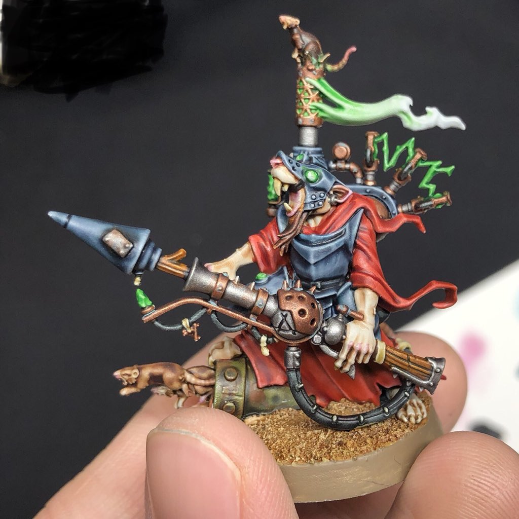
Though I do want to try something more substantial like a skaven after seeing Mengel’s stuff.
LikeLiked by 1 person
This is excellent work on several levels. I’m skeptical of the contrast paints but from reading this, it seems like I may need to give some of them a try because the results are really impressive! Shadows of Brimstone is a game I’ve been intrigued by but haven’t heard good things about the minis and the game looks a bit complex for a solo gamer. It is cool to see you paint up a mini from the game to such a high standard.
LikeLiked by 1 person
Skepticism is fine, but delcaring that they’re rubbish paints only fit for beginners and babies is just as bad as bad as saying that they’ll win you a Golden Demon or Crystal Brush.
A year ago I basically reposted the info from Dakka posted by Les Bursley on his homemade washes which are one of the home-made precursors (in many ways) to Contrast Paints.
Of course, since you need to make them yourself, they (and presumably, their use) must be for advanced modellers, not like these Contrast Paints! 😀
I still haven’t played SoB. The minis range from solidly decent to horse poo in quality (wait till you see the next ones!) but I have heard that the game is really good, and also solo-friendly. I guess the BGG forums would be a better place to find out more info.
As far as the figures go, they also promised that the minis from their second KS campaign (the Asian-themed one) would be MUCH better than the first ones, though I haven’t examined any of those yet – and then again promising that the third campaign models (Vikings and Conquistadors in South America) would be better again.
LikeLiked by 1 person
The Contrast paints are so widely discussed that they’re going to evoke all kinds of reactions and I’m sure they’re are some who are taking it too far. They look very valuable for getting stuff painted quicker but my skepticism lies around for making your miniatures look as good as they can. This mini certainly challenges that because if you can paint something fast and really well then Contrast paints will definitely become more of a tool in my toolbox. With that said, I get set in my ways a lot of time (especially if I have developed a good technique for something) and I’m sure that contributes to my skepticism! 😀
I will be curious to see the next minis and the cost and mini quality is really the only thing that scares me away from Brimstone. The Asian themed one sounds really cool to me and that might get me to give the game a try. I would be highly interested in a re-release or updated version of the original game as well. Not sure where I’d find the time to paint them with all the Middle Earth stuff I have but you never know 🙂 I think the breadth in subject matter of what you paint is a bad influence on me and making me want to take on all kinds of projects 😀
LikeLiked by 1 person
The way I see it is that Contrast Paints are a tool. Another one, alongside premade washes and airbrushes – that will take a bit of learning and getting used to in order to use them to their fullest potential.
Like premade washes and airbrushes, you can use them exclusively to get entire models done to a quite decent tabletop standard, but to get to the next level in most cases for most people, you’ll need to add some more traditional techniques.
Like Airbrushes and washes, they have the ability to speed up segments of the painting process, and the ability to create a distinctive look when they’ve been used.
My opinion is if you treat them like another tool, and learn to use them, then you’re doing it right. Worshipping them and shitting on them are both equally redundant. Oh, and never stop learning. My flesh today is better than it was three or five years ago, and I’ve been painting for more than 30 years. Trust me – I know all about “set in my ways”!
The next contrast minis I have up look a bit shit, but that’s more to do with silk purses and sow’s ears. On the other hand, garbage models appeal to me as an ideal guina pigs for experimentation, even if the final outcome is mediocre at best.
Pretty sure you can get most of the SoB stuff from Flying Frog direct or a few retailers on the US. I doubt we’ll see a remake of the first box though, as their way forward is clearly going to be KSing new variations with the rules changing that way as their models slowly (or less slowly, hopefully?) improve…
As for new projects, my best suggestion is to keep to small, managable projects if you’re going to start new ones beyond the ME stuff. Dual-purpose ones work well, or “closed” ones such as boardgames. Bonus points if you have boardgame minis that can also do double duty in ME!
…yeah, do as I say, not as I do!
LikeLike
Nice! I like the creepy tentacle-tongue this beastie has going on.
Also, on a side note, I’m glad it isn’t just me who cringes at their own voice in recordings. I sound like a damn seven year old and I hate it, so I feel your pain! lol
LikeLiked by 1 person
I think it’s a pretty normal reaction. Getting past it is the hard part! 😉
LikeLiked by 1 person
Cool mini! Your paintwork is admirable 🙂
LikeLiked by 1 person
Thank you, Ola. I appreciate it! 🙂
LikeLiked by 1 person
You’ve done an absolutely outstanding job on the model, mate! The effect on the boney/chitinous carapace is rather wonderful, and it contrasts perfectly against the more organic pinks of the tongue. Really seems like a very successful experiment in using Contrast Paints all around!
I also really like the sculpt: It’s from the same manufacturer that also did that worm beast you painted sometime last year, isn’t it? The weird tongue setup seems strangely familiar…
Anyway, a fantastic piece! 🙂
LikeLiked by 1 person
Cheers, KS – it’s notsomuch me that deserves the credit for this one, as all I did was follow “the instructions” properly and then touch-up and detail. It’s a good example of “best standard use” for these paints, though, I feel.
I’m wanting to dig out a few (plastic) skaven as guinea pigs to do some clothed models, and I’m still (slowly) getting some Wargs together for what will now be experiments in getting naturalistic fur effects with Contrast. They were just going to be the usual drybrush/glaze/wash job that I normally use, and they’re low-importance models except for the alpha, so a good canvas to learn with.
You’re right – this model is from the same game as the Worm thingy as you said – there is indeed a solid connection between the two in the tentacle-tongue sculpt. 🙂
LikeLike