

….k-k-k-k-kombo post here this time on the Contrast paints front. Also, not neglected models like it’s ‘sposed to be for this month, but these were cheap and so I tacked them onto an Amazon order I placed for other stuff recently. I’ve seen a few of these models made from transparent plastic and have been prety impressed. They (and the entire line of PVC models from Wizkids/Neca) really do leave Reaper’s Bones stuff in the dust in so many ways, and I’d always wondered what could be done with the transparent ones using washes or now, Contrast Paints. So now I know a little more than I did. Since there’s not much out there that I could find, written on this topic (that I could find, anyway) I’m posting it here today. I’d have taken step-by step photos, but I didn’t plan to write this post in this form at the time and my focus was on just wanting to paint my minis and figure it out, rather then “create content”.
I first painted the Water Elemental on the left, the darker one. I hadn’t glued it to a base, instead blu-tacing it down to a plastic base. (*I’ve used 30mm plastic bases on all of these rather then the 25mm rounds that they come with). Wanting a nice dark, sea green, I painted the whole thing using Contrast Akhellan Green except for the outer halves of both arms. I then dropped a drop (funny, that) of Contrast Medium onto both, and worked my way up and down for a slightly lighter and thinner depth of colour on the “forearms” and “hands”. It went on decently, but there was a bit of beading happening that I had to solve by going over and over them. Still, I finished it and then I left it to dry.
When I came back to it, I was honestly not especially happy with it. I’d always intended to differentiate the two, so on the second one I first painted the base “legs” area with Contrast Telessar Blue, then the chest and above and below with Aethermatic Blue. Again I dropped some Contrast Medium onto the forearms and worked it with the paint applied to the rest of the model to blend it more thinly into the extremeties. Again, I left it to dry.
Once both were properly dry, I really thought the lighter one looked a lot better, and then glued both down and based them. I wasn’t super happy with either, though, so I decided to try lightly and carefully drybrushing some white onto the “hands” and the bottom of the models, as well as on “swirly” bits that gave the impession of where the water might foam – as well as a touch on the “face” to distinguish it slightly.
Finally, I decided to spray them both with gloss varnish. This effect gave a HUGE improvement to both models, and I’m now satisfied with both of them as well as what I learned from mucking about with Contrast Paint on the pair of them.
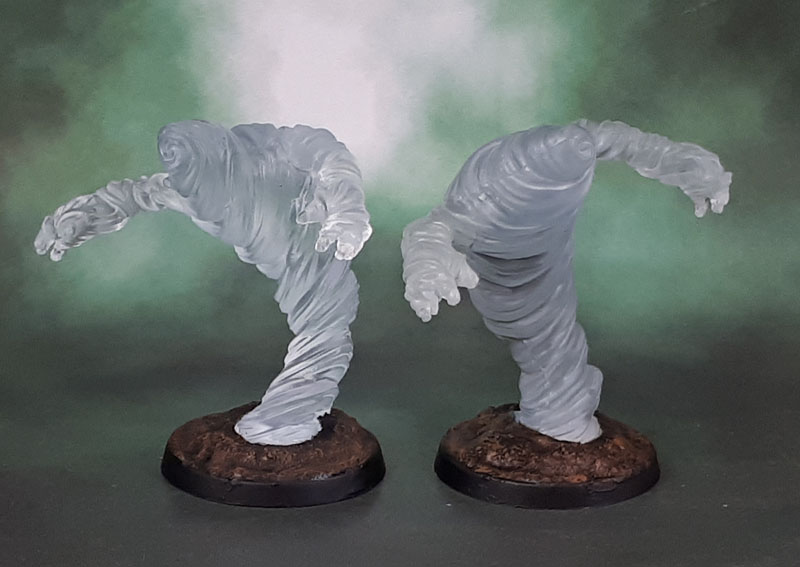
I also had this pair of Air Elementals. To be honest, these looked pretty good and fit for purpose as they were, so I decided to leave one as stock and just base it (the one on your left). For the other one, I thought a grey might look okay – not quite smoke, but not especially clean-looking air. I wondered how paint might adhere if I sprayed the figure with a clear satin coat – kind of like an invisible primer. Would it prevent the beading that occured in the Water Elementals? yes. yes it did. Though in retrospect, I should also have tried washing the oils off in a surfactant like some dishwashing liquid. Something for next time when I get some more, similar models perhaps? Anyway, this time I chose Apothecary White from the Contrast Range, which is a pale grey, meant to shade white models. The “priming” did work and worked pretty well, though the model itself is a little boring.
Something else I noticed after basing these two was that the fact that their bases have the bottoms painted/primed white gave them an effect where they “pop” from the dark bases underneath much more than the Water Elementals. I do wonder how it would have affected those models if I’d done something similar rather than just supergluing them down to the black plastic bases. Something else to consider with my next trial of similar models perhaps?

Nice idea with the white on the base underneath a transparent mini.
Very surprised to hear you think WizKid’s stuff is so much better than Bones – my experience has been the opposite. I realize I’ve been comparing some of the first Nolzur releases with some of the latest Bones releases, though.
LikeLiked by 3 people
Having been on the Bones train since before the first KS, and having also some of the stuff in their new material, I have to say that although the “New” bones is nicer to work with than the original stuff, the current Nolzur/Wizkids models I’ve been getting are a lot better in terms of detail and the same or better in terms of working with – they’re not hydrophobic, which is kinda nice for something you’re painting.. and no post-paint tackiness at all so far.
No idea what the older Wizkids ones are/were like, though. The old PVC WoTC models like the boardgame models I posted the other day of the Kobolds and their many prepaints aren’t great….
LikeLike
The hydrophobic thing is a very fair point. While I’ve gotten used to having a different prep routine for my bones minis, I can’t deny that it is a hassle to have to do things differently to avoid the risk of tacky paint. Can’t say I’ve been terribly impressed with the pre-primer job on the Nolzur’s I’ve worked with, but at least it isn’t actively working against me.
I can’t shake the feeling that Nolzur’s (along with a lot of modern digitally sculpted stuff) are designed by people who’s never painted a miniature in their life, and really haven’t inspected their own work physically before it’s sent off for production. Very subtly defined details and tiny features that just get lost on a 3cm tall figure. I’ve seen some very unfortunately placed split lines on multipart figures too, resulting in some tragically deformed faces and such. Much less of a problem on large monsters than the humanoids, though – and all my experience with Nolzur’s humanoids is from the first couple of waves. Things might have gotten better. I’m really hoping so – people are saying Nolzur’s match Modiphius’ Elder Scrolls minis nicely in scale, and I expect to go all in on that stuff.
I’ve been repainting prepaints since the early WOTC days, 100% with you there 😅
LikeLiked by 1 person
I’ve tried various means to prep Bones. Some work, like completely painting them with watered-down liquid greenstuff or “priming” them with Reaper’s “liner”, partially work, like spraying with shellac (cracks because bones is so bendy) or nol work well, like gesso (thick and brush-stroke pasty, obscures detail) – so yeah, that feeling of actively working against me is a hard one to get past with Bones.
I do agree with you in part for the Nolzur’s ones – I painted some barrels awhile back, and noted that the shallow details seemed much more suited to a 3D render in a videogame than a miniature model.
I bought the Wizkids Treant the other day, and it has some join lines that’ll ned to be puttied, but that’s no different to bones or a lot of other models, including some of GW’s plastic efforts and certainly a lot of metal multiparts.
Still, the majority of my new purchases are from GW, and while I have a ton of Bones from the various KS, the PVC stuff from Nolzurs really have a mainly “oh, that thing looks interesting” role than a primary one in my hobby, so I’ll probably not run into the models that you’ve had issues with (or their newer ones, that may or may not have similar!) so it makes sense why I haven’t run into the same issues – while having a large Bones KS stockpile means the opposite there…
LikeLike
I reckon these look ace mate! Is there afire one??
LikeLiked by 5 people
Thanks Alex. Yep there’s a fire one that was OOS when I prdered these ones. Got a pack on its way to me now, though for some more experiements…
LikeLiked by 2 people
Cool, looking forward to seeing the results of that!🔥
LikeLiked by 2 people
Looking great mate.
LikeLiked by 4 people
Cheers, mate!
LikeLiked by 1 person
Everyday is a learning day!
I’ve always been in a quandary about what to do with transparent minis, and I think this is definitely the way forward, they look great.
I personally prefer the darker water elemental; I like the white drybrushed on to the hands, it really contrasts with the body.
LikeLiked by 4 people
Yeah it does look a LOT better after the gloss varnish. I thought it looked shit before but I now like how it turned out.
LikeLiked by 2 people
Simple in a way, but very effective result! 🙂 I like them all!
LikeLiked by 4 people
Thanks John. Ol’Smoky is a bit average, but I’m not going to beat myself up over the way an Air Elemental turned out, especially when it was an “I wonder what will happen if I…?” type job.
LikeLiked by 2 people
Very nicely done, painting clear mini’s is an art in itself!
Cheers Roger.
LikeLiked by 3 people
Thanks mate. It’s certainly new ground for me to figure out, anyway!
LikeLiked by 1 person
They have turned out very nicely. Great work.
Cheers,
Pete.
LikeLiked by 2 people
Cheers Pete. I’ve got some more on the way to play with once they arrive.
LikeLiked by 2 people
Great effects you’ve achieved there, and thank’s for sharing your findings
LikeLiked by 2 people
Welcome, Dave. These “contrast paint” posts work for me as something I can return to and reference, but I think this one might be more useful to other people than a lot of them since I was trying to see if I could find anything other people had written about clear minis+contrast and could find nothing useful…
LikeLiked by 2 people
Nice result I think. The contrast paints are pretty good I think, not as good as the old inks with the white screw top lids from the bolter shell bottle days, but the next best thing. Though they do have real problems with pooling if you are not careful, I have found.
LikeLiked by 2 people
I’ve still got a couple of those old Citadel Inks left, though I also have a ton of Artists Inks from Daler Rowney and Windsor & Newton that have some play now and then, and those Citadel ones were just repackaged art inks. Both do have issues with pooling, so painting models a segment at a time and also how you balance them for drying both make a big difference. The “official” GW “slap on one thick coat” method isn’t really for me personally…
LikeLiked by 2 people
Nice work there! There was a live stream Water Elemental painting I watched last week: https://bit.ly/2SJdFO9
He didn’t use the clear coat beforehand like you did. I didn’t stick around to see if he gloss coated at the end either. The livestream seemed kind of long winded to me, but I guess I was expecting something more like the painting techniques/tutorials I usually watch.
All four minis look pretty cool. Might just be the light, but I really like how that Air Elemental turned out. Looks a bit cloudy. I’ll definitely be keeping your techniques in mind, when I tackle my own!
LikeLiked by 3 people
Just clicked and scanned it. He glosscoated it at the end, and may have added a bit of green to it as well, as they were talking about “Seeing the green”. He seemed to like his traditionally painted elemental better, but even though that one was technically superior, I think the transparent one looked better and more “realistic” simply due to the material.
LikeLiked by 2 people
I liked the transparent one better as well. Maybe a bit of nostalgia on his part, for when minis were all made of lead/pewter. Even back then though, I felt like something was just off with traditionally painted water and air creatures. My own minis were the worst, of course! 😉
LikeLiked by 1 person
Yeah. Models like that might look good, but they’re clearly solid objects painted as water with an overall effect not unlike a mural or a painting on a wall.
The transparent ones might not catch all of your careful highlights and shading, but if they look even more like the thing they represent, then I’m all for ’em!
LikeLike
I’ve seen this translucent mini become more popular recently and I wondered how people were painting them so this post definitely caught my eye. I really like the air elementals and I think they match the kind of image we typically have in our mind for that sort of thing. Painting those water elementals in a way that looks realistic is really tough. I’m not even sure where I’d start to be honest but I think you did as well as anyone can hope for in a reasonable amount of time. One of these days, I’m going to try messing around with Contrast paints as you seem to always be getting great results with them!
LikeLiked by 2 people
The Contrast paints are definitely a tool worth adding to your arsenal in my opinion. I think the biggest issue with the water elemental is the actual sculpt/pose. If you took one of each painted up appropriately and asked someone to guess which they were, there would be no problems guessing they’re water elementals, and the gloss adds a lot to them from the way they looked out of the pack and even unvarnished.
LikeLiked by 2 people
I’m all for saving time and if Contrast can do that, I’d consider them. I get a bit stuck in my ways and tend to go with what I know works which is a bit part of my problem. You might be right on the sculpt. It is definitely inferior compared to the air elemental I would say.
LikeLiked by 1 person
You’re not alone in that. As someone who’s been painting since at least the tail end of the days of (mostly-gloss) Humbrol Enamels and jars of stinky turps, I can say that I do find it interesting how many painters that have come up since do become really set in certain methods that they’re used to, and even worse become angry when people don’t do things the “right” way.
Over the years I’ve read many silly rants from people against “not undercoating”, not “drilling gun barrels”, “not cleaning mold lines”, “never paint from the pot”, “only ever use a palette”, “only ever use a wet palettte”, “contrast paints are exactly like inks/glazes/etc”. Some of these people have been good painters, but many are …not (I usually tend to try and check the work of anyone who thinks they’re paying wisdom down from on high).
The thing to remember is that we all have our set ways of doing certain things, but if you’re set on sticking to that it can become a dogma, and you might refine what you do, but you might not even do that – and you certainly won’t be learning anything new…
I mean, I’m not going to use a rare, Limited Edition Black Templar Marine Captain model from 10 or 20 years ago to test the Black Tempar Contrast paint on, but there’s plenty of other models I can do the same with that have very low “risk”. I mean, I could strip a model if it’s a complete horrorshow, but I do prefer to either press on, or keep going – and slightly disposable models provide a good outlet for that level fo testing and experimentation…
LikeLike
Thanks for sharing your experiences with the Contrast paints via these models. Always helpful and something I aim to do as well with my posts. I also like that you included the concept of the gloss varnish – there are times (like here) when gloss is a definite need. Nice stuff as always Az.
LikeLiked by 3 people
Thanks Mark. I don’t have any particular need for these Elementals, but I thought it would be worthwhile having a look and seeing how the paints worked with/on them. Time well spent if only for my own curiosity, and so much the better to share it so others can decide if it works for them as well.
The fire elementals have now arrived. They won’t make it to paint until the next tray now, but gloss or not wil be an interesting question for them..
LikeLiked by 1 person
Incredible models mate, and you have painted them up so well, I wouldn’t have had a clue how to approach painting these!!!
LikeLiked by 2 people
Cheers Pat. I’ve seen the models and wondered if the transparentcy in the contrast paints would work on them – and if so, how well.
You know the saying – only one way to find out!
LikeLiked by 1 person
Pingback: D&D Monster Manual 30: The Legend of Drizzt – Water Elementals | Azazel's Bitz Box.
Pingback: D&D Monster Manual 36: Temple of Elemental Evil – Earth, Air, Fire and Water Elementals | Azazel's Bitz Box.
Pingback: More Nolzur’s/Deep Cuts D&D Miniatures | Dragons of Lancasm