
Several months ago, I was contacted via this blog by a kind person from Editions Caurette, a small publisher based in France, asking if I would be interested in reviewing an art book showcasing the work of Karl Kopinski. Since I’ve been a fan of Karl’s work for over 20 years now since I first saw his work in a number of Games Workshop publications, I accepted the offer, with the caveat that I would of course only be willing to write up an honest review, which was understood and accepted without hesitation.
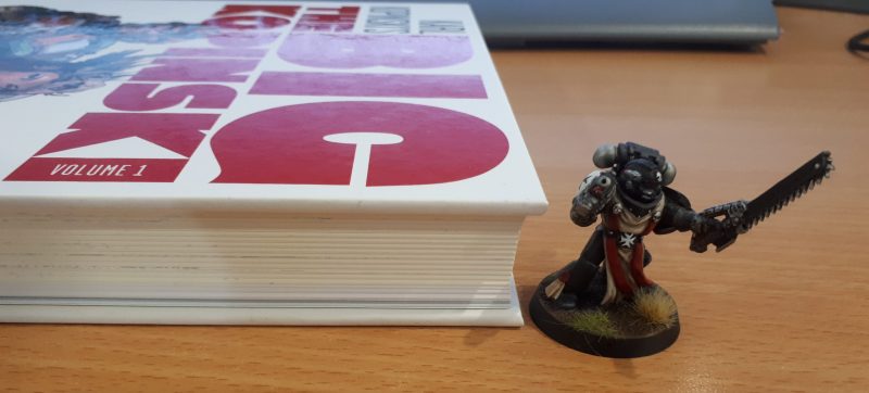
I guess the thing to point out here is that since I’m already an existing fan of the artist’s work, the chances that I would dislike the book were not going to be huge, but sometimes an art book can fail not due to the artist or the artwork, but by the physical execution of the book as object failing to be up to par. So the first bit of good news here is that this is far from the case. The book is a quality production on the outside, with a solid hardcover adding additional heft to the almost-300 pages.
On the inside, the book also feels quality, with two types of paper being evident. Now I’m not someone with a great deal (or even much) knowledge about publishing, so I absolutely do not know the correct terms, but the art within basically falls into two types:

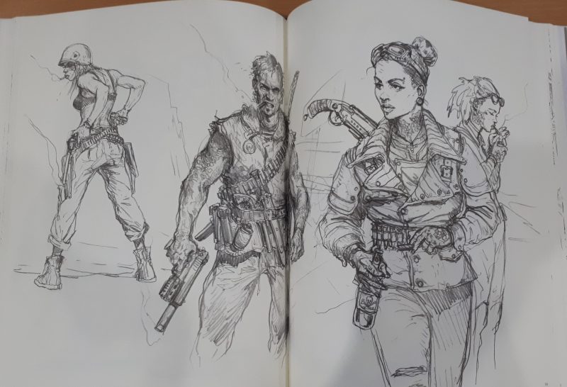
Sketches – which are displayed on a slightly off-white kind of paper that gives a look (though not the physically rough feel) of an artists’ sketchbook. This is one of those things that works on an unconscious level, and is quite apt for an authentic feeling display of the sketch-art within.

The second type of paper is a much whiter (and fractionally smoother) kind, and is used to display the painted pieces. That’s pretty much it for the physical characteristics of the book, but I figured that it was worth going into, as I’ve certainly purchased products with “Art books” featuring some beautiful work, where the “book” really doesn’t deserve the term. I’m happy to say that in this case, the physical book is a solid and substantial product.

This leads me to the downsides of the book. While there aren’t a lot of them, the artwork has no captions, no dates, so unless you recognise a piece, you really have no context for it outside of being an attractive piece of art. Not a dealbreaker, but it can be nice to know more about a piece than what is displayed on the page.

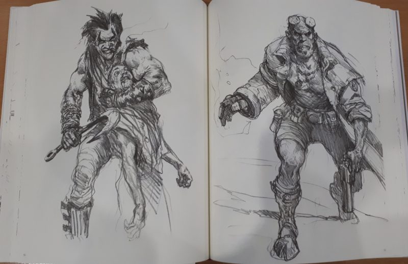
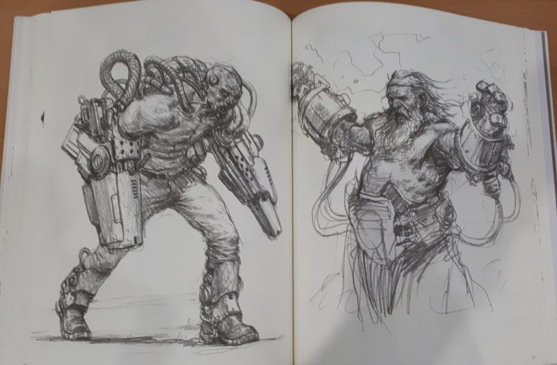
The other issue I have with some of the presentation is that of some artwork being presented across both pages of a spread. I find this one of the worst ways to try and view art, as so much of the image is list down the gutter in the middle of the pages, especially when a piece of art is not created with that “dead area” in mind. An example can be seen here, and while it’s not done to egregious lengths, I’d prefer that this was not done at all in artbooks – unless – as mentioned, it’s a piece created with that in mind. Still, it’s not a deal-breaker, as it happens only a relatively few times throughout the book.
Now though, we need to discuss the art within. After all, an art book is nothing without quality content, right?

There are a few general themes of the art found within this book. The book begins with a number of fairly generic “medieval fantasy” sketches, which to me, give a “Dungeons and Dragons/Magic: The Gathering” feel (as opposed to a “Warhammer” feel) – these transition to sketches that more strongly feature what I’d call “fantasy vikings” and “fantasy barbarians”

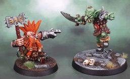
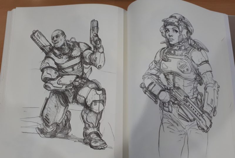
As one continues through the book, the sketches and finished pieces within continue to be clustered within loose “themes”. There are Pirates, Victorian folk, Napoleonic troops, Wild West, Samurai, Mobsters – many of which have fantasy and/or sci-fi elements mixed in. Comic heroes, characters smoking, armoured characters, and on it goes…

At a certain point, while I feel that I could continue to ramble on pretty easily, it’s probably better to show, not tell – especially in the context of the review of an art book. It’s not like I’ll be showing off all near-300 pages of content, and as anyone who actually buys this sort of thing will agree, the purpose of owning a book like this is more than about having access to the artwork – which is why I discussed the quality (and sometimes lack thereof) publications so much earlier.


Sometimes, a piece feels like it has a strong inspiration from another artist, like Moebius (Jean Giraud), other times it looks exactly like you’d think a Karl Kopinski piece would be. I’m a person who can quite enjoy it when I can see influences of other artists in a person’s work – whatever the medium – and the pieces scattered throughout this book are no exception.


If representation of women is a potential issue, you can rest assured that the book features a nice variety of poses, images and modes of dress, and overall the footing is pretty even with the male characters displayed within. Of course, I’m now going to highlight a pair of my own favourite pieces of the female art within this book, and yes, there’s some skin showing!
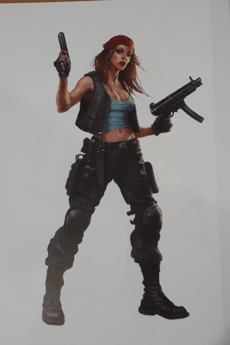
From my own familiarity with a few pieces, I can see that some of the artwork featured were commissioned for various games. Here’s a picture of Marouda in her Zombicide guise of Angry Mary, for example. As noted earlier, there are quite a few series of images that also really feel like “character art” for other games that I’m unfamiliar with – though it does makes perfect sense for an artist known for their work in games.

Speaking for myself, I find a number of the pieces rather inspirational for my own work as a hobbyist miniature painter. As an example, looking at the female post-apocalyptic ganger above, I fully intend to paint up a Necromunda Escher figure with the art as a direct touchstone.
While I had hoped to have this review done quite some time ago, I’ve barely posted in the last month due to various family issues that have needed my time and attention. Still, we need to have a conclusion here – and here it is:
While The Big Kopinski Vol 1 feels more like a random selection from Karl’s sketchbooks rather than a focused collection of any one aspect of his art, I’ve still enjoyed looking through it a number of times now. The broad brush that the art is chosen with, along with the large page count and number of pieces featured within mean that pretty much every time I’ve browsed the book, I’ve found (or more often rediscovered) something that makes me go “oh, cool”.
While I’m personally a big fan of his work for GW in particular, and finished, coloured artwork in general and was a little disappointed in the lack of any of the former or more of the latter, I do enjoy “sketchbook” art quite a bit as well, though often I find it more rewarding to look at when juxtaposed with the finished piece, and being able to view the small changes and decisions in the transition from pencil sketch to fully finished, painted art.
Would I buy it? I actually do casually buy the odd art book. And while I received this one gratis in exchange for the review, I think I would actually be happy to purchase this one, depending on the price asked. As I said upfront, I’m a fan of Karl’s art, and so I’ve been positively predisposed to the book from the beginning – but then the same applies to all of the artist-focused art books I’ve bought.
If you’re a fan of Karl’s art, this would certainly be one worth checking out. If you’re not all that familiar with him or his work, then the art shown in this review would be a good indicator to see what you think.
For further perspective, a couple of other reviews worth checking out from individuals in the blogging circle that I’m a member of would be Dave/Scent of a Gamer, and Spalanz.
The Big Kopinski Volume 1 can be found and purchased from Editions Caurette.

Wow, his art is amazing, This book is a must buy, as you say, it’s so inspirational, thanks for the review.
LikeLiked by 1 person
Very welcome. It’s a very nice collection of, like myself you’re already a fan.
LikeLiked by 1 person
Gah. I guess they chose ok for promo sucka, after all. Even on a budget there’s room for finds like this, thanks Az.
But side-eye for printing in the gutter. How dare they.
Have you seen any of Simone Bianchi’s stuff? Nothing as large as KK’s book here, but some nice work in progress comics stuff. I like his painting more than, say, Alex Ross (whom I like but not Bianchi like).
LikeLiked by 1 person
From a moment’s googling, it looks like review copies went out to quite a few blogs. I’m the tardy one in this instance, as I believe most of them would have gone up some tie ago now.
Bianchi is great, though I don’t own any of his books/collections.
LikeLike
Looks good to me – disappointing that there is no GW stuff in there though… I believe GeeDub retain ownership of art created for their ranges, so not surprising
LikeLiked by 1 person
That actually may still be a bit of a grey area, since it was revealed in the Chapterhouse case that they simply believed that they owned everything that freelancers did on commission fully and completely – without actually being aware of the way that rights for artwork fully worked. Something about not having asked the artists to fully sign their rights as part of the contracts.
I expect (like you) that they may have worked that out by now, after all, they’re rather litigious and also a potentially rather large bridge to burn for a freelance artist.
Still, I’d have loved to see a bunch of the GW stuff included amongst the other pieces.
LikeLike
Also former GW artists in many cases seem to still own the originals and from time to time they sell them. This largely seems to have happened before I had the money or inclination to buy any and I suspect now they’d be too expensive anyway, sadly. Great review though, I’ve always liked Kopinski’s work too.
LikeLike
I clicked on this thinking it was Dave/Scent doing an art review, like he often does. Nice to see it was you instead. Good review, great art. I’m sorry now I didn’t get his Zombicide BP figures.
LikeLiked by 2 people
Thanks mate. After doing this one, I feel like it might be worth dusting off some of my other art books and doing reviews of those as well. I’ll never do or have as many as Dave/Scent, of course, but it might be another fun little thing to do from time to time…
LikeLike
Great balanced review of the book and art Azazel
LikeLiked by 1 person
Thank you, Dave!
LikeLike
Very cool and very inspirational
LikeLiked by 1 person
Thanks, IRO. I just wish there was a lot more full colour stuff for me to rip off/use as direct paint inspiration. 🙂
LikeLiked by 1 person
Haha. I guess it’s just down to you and your imagination then mate 👍🏼
LikeLiked by 1 person
My what?
Jokes aside, it’s more a matter of full colour art bring good for painting inspiration where b&w cant achieve the same effect for obvious reasons.
LikeLiked by 1 person
True. With mum hate project at the moment I’m finding it both challenging and fun to make the models pop and look cool but using only black white and greys. Plus blood for the blood god on some too.
LikeLiked by 1 person
Looks like a pretty cool book. Great artwork.
LikeLiked by 1 person
Cheers, C&M – there’s some great stuff in there.
LikeLiked by 1 person
Great review- a pleasure to read.
Cheers,
Pete.
LikeLiked by 1 person
Thank you for the kind words, Pete. 👍
LikeLike
Does look a very nice book! Thanks for doing the review! 🙂
LikeLiked by 1 person
Very welcome John. Thanks to Editions Caurette for reaching out to make it possible.
LikeLiked by 1 person
Wow, that is some amazing art, and like you, Karl’s work is some of my favorite. The lack of annotation is disappointing, as even titles and dates could help you track down the information about where the art originally appeared, what client it was done for etc. A full paragraph or two of information and commentary from Karl would of course, be ideal.
Currently the book seems to be 75 Euro shipped anywhere in the world, but there is also a 305 Euro version where you get a custom drawn Kopinski cover…
LikeLiked by 1 person
That custom cover certainly sounds tempting, especially if Karl is willing to take suggestions on the content of those covers!
The lack of annotation is unfortunate though not a deal breaker – at least for me. It certainly would have been nice to see though, even for some of the pieces or in a simpler form describing a series of pieces are these work commission for X game, for Y company in Z year.
LikeLike
Thanks for the review, was fun to read and see the art.
LikeLiked by 1 person
No worries at all, Mark. It was fun to do something a little different.
LikeLiked by 1 person
Wow – that is a visually impressive tome you’ve got there. Seems like it would be all a DM would need to provide visual representations for an entire campaign’s worth of characters.
LikeLiked by 1 person
It might not have that many due to the diverse nature of the image sets, though you could certainly give it a good quality try… 🙂
LikeLike