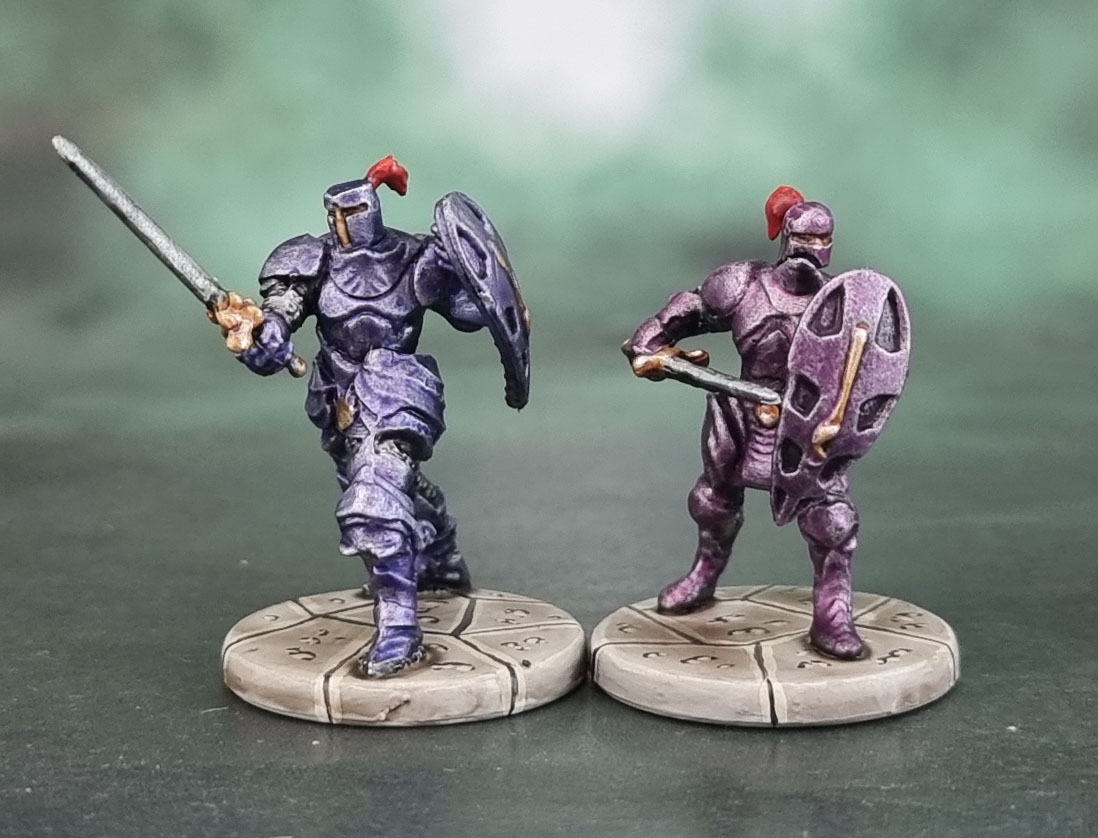
We’re back to the trashy D&D models today, this time both models are completely awful sculpts – to the level where if I wasn’t tracking everything that I paint with the blog I wouldn’t post them at all, and even then I’d not be posting them if I had some other monster models from the same set to bundle them in with. But with the days of May at their end, I’m just treating the blogging process for these two models the same way I had to treat the painting process – like ripping off a Band-Aid! Now apparently the Shadowdusk clan feature somewhat in the fiction of D&D, though I’m entirely ignorant of how important or how featured they are across the media, particularly this pair of siblings. Apparently they’re Death Knights and most likely undead by the point in the timeline that we’ll be encountering them in the aforementioned Dungeon.

It’s hard to understand how a company with any level of art editing would let these two sculpts through for anything beyond shitty grunts – let alone a pair of named characters of any importance. Even Gary Morley’s original Nagash sculpt was an imposing model! With that in mind, along with these sculpts being absolutely shit-awful, I decided to ignore the worn, rusted metal that they’re depicted as having and go straight to colourful plate. A little inspired by World of Warcraft in some ways, but equally since they’re supposed to be bosses of some description in the game, and plain armour with shitty underwhelming sculpts would just make them look like a pair of unimportant grunts. So to make them stand out, they both got metallic armour in different shades of purple, so they can both stand out from the grunts in the game while also being able to tell them apart.
Aaaand that’s pretty much it for these two…

Great work mate, on these uninspiring models, I applaud your commitment to getting them painted, as I don’t know I could be bothered ! LOL
LikeLiked by 3 people
If I weren’t finishing “full boxed games” then I wouldn’t have bothered – even though they’re pretty simple to paint.
LikeLiked by 1 person
The two different metal shades have come out very well though, so a good call not to go with a rusty, aged finish! 🙂
LikeLiked by 2 people
Yeah, as Villains depicted by trash models they would have looekd entirely like grunts. At least this way they stand out enough so we don’t miss them and kill them faster!
LikeLiked by 1 person
With your skill they have come out great. Like John the metal shades are ace!
LikeLiked by 1 person
Haha thanks mate – if nothing else they were a bit more practise for coloured metal armour when I need to do it for better quality models! 😉
LikeLike
Oooof, yeah, awful models 😬
Still, nice work on that armour dude – turds successfully polished 🤘
LikeLiked by 1 person
At arm’s length, anyway! 😉
LikeLiked by 1 person
The armour looks great… the figures themselves… no! The heads/helmets are horrible. I had to look up the names since I’d never heard of them and was surprised to see that Dezmyr (whichever one she is) is female!
LikeLiked by 2 people
I guess that’s the one realistic aspect of them – no boob armour! The female character is the one in Magenta Armour, as opposed to the Darker Purple.
LikeLike
Yea, I would have thought they were grunts if it wasn’t for your painting and comments! Did you use the AK colored metallics or some contrast magic on them?
LikeLiked by 2 people
Thanks mate – I used either Contrasts or GSW’s Dipping Inks (basically Contrasts) on them – One in Magenta and the other in Purple before drybrushing over the top with a bit of silver.
LikeLiked by 1 person
Nice work on cack sculpts
LikeLiked by 1 person
Cheers mate. They certainly are!
LikeLike
I don’t want to insult the sculptor but these are probably the roughest sculpts I’ve seen you paint in a while, if not, ever. Good on you for getting ’em done and doing so in a way that minimizes pain and frustration for you, mate.
LikeLiked by 2 people
Yeah, they’re pure trash. These models deserved and receieved little effort to get painted. Spray Black then Gunmetal, Wash with purple contrasts. Pick out the chainmail, wash that with black, drybrush, two reds for the plumes and that was most of it done.
At arm’s length on a boardgame tile, though – they’ll be fit for purpose and still better than unpainted shiny dark blue plastic.
LikeLiked by 1 person