

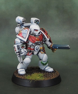
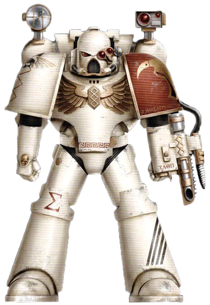
I’d planned to finish three specific models this past weekend, but as it happens I got distracted by cleaning the house, sorting miniatures, mowing the lawn and watching the Mae Young Classic with Marouda, so in the end I only managed to complete a single figure – this Apothecary. Despite buying this model (and all of his contemporaries) on release back in the mid-1990’s, this is the first post-RT apothecary that I’ve painted, and boy, is he one fiddly model! I thought the Dark Angels Veteran Sergeant that I finished a couple of weeks ago was saturated in detail, but this guy puts him to shame.
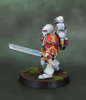
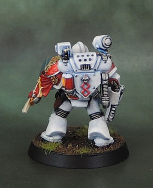
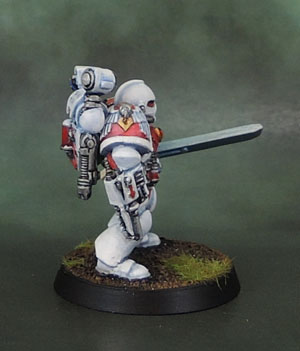
The model itself is an Apothecary circa 1995 or so, with a metal arm with power sword from the 3rd edition Death Company box from 1999 pinned on. Not the first of the contents of that box that have popped up in my other units… The shoulder pad is a Forge World Minotaurs pad with a cloth draped down the arm, which looks good on one hand, but obscures a bit more detail than I’d like on the other hand.
“Clean” white is a notoriously tricky colour to get right. I can see why painting dirty white (Death Guard) and weathered white (World Eaters) is so popular. Still, I thought it best to keep his armour to the traditional white and keep the accents to red with a touch of gold and silver – keeping him tied in fairly strongly with the rest of the Minotaurs.
His Narthecium was a right bloody pain in the backside to paint. There are a lot of fiddly elements on it, and wanting to achieve a neat and clean look to it while picking out all of the distinct parts took a toll on my patience.
Similarly, all of the vials on his belt (and those on his backpack) also added to the over-fiddlyness. I chose to paint his spotlight lamp in silver tones to represent it being unlit, rather than the more commonly seen bright yellow. Between the vials and lenses all over this model and the wreath on his shin and the bluish tinge of the power sword there are already quite a few colours on him and I want to avoid the “skittles” look that Space Marines (particularly HQ specialists) can sometimes start to have. That’s also why I kept the vials on his belt and backpack to a couple of tones of red with a little yellow for the sole variation. We don’t need blue and green on the vials as well.
In the end, I’m very happy with the final product, and I’m aware that I need to sort out an Apothecary for the Dark Angels as well, but I’m not massively enthused by the thought of doing another one of these guys particularly soon. I might have to give the DAs one of the Forge World sculpts instead to keep it interesting…

I really like the shine you’ve added to his chest gem.
LikeLiked by 1 person
Thanks, Curis! 🙂
LikeLike
So clean. Love the FW pad. Nice work on all the details Azazel
LikeLiked by 1 person
Cheers mate!
LikeLike
Brilliant. Love these 1990s Apothecaries but strangely I have never owned one of the models.
LikeLiked by 1 person
Now you have another new goal for the year… 😉
LikeLiked by 1 person
Nice job dude – he looks quite the pain to paint! I’m intrigued that you went for so much clean white, and with none of that lovely Minotaur brass that you do so well – does he fit in ok with his fellows?
LikeLiked by 1 person
Thanks mate. A big part of the influence on his scheme was the artwork in the Badab War book where the Apothecary pictured is very much clean white – much moreso even than the model I turned out in the end. He stands out, but I guess that’s the point? I don’t mind the official black of Chaplains, or the white of Apothecaries or even the Red of Techmarines, but for some reason the Blue of Librarians really irks me – so I’ve done far more of a mix on the Minos’ Librarian that’s currently WIP…
LikeLiked by 1 person
Ah cool, that makes sense mate. I agree with you about librarian blue though – that is pushing it a bit I feel 😉
LikeLiked by 1 person
I think the Librarian palette change came about in 2nd edition wheras Chaplains and Medics had the Black and White established in the early RT days, along with the obvious thematic connections of white to medicine and black to guys wearing skulls on their heads. Techmarines in red were also acceptable since it was already a strong thematic link to the Adeptus Mechanicus of Mars.
LIbrarians in blue seemed to be more about “those other specialist guys all have colours”, let’s go with blue because ultramarines!” since Wolfy Rune Priests were already happily wearing grey.
LikeLiked by 1 person
You’ve done a fantastic job on this mini, especially the white armour, very well done. I’ve got this very miniature knocking around and have been planning on working on it myself soon, thanks for the inspiration!! 🙂
LikeLiked by 1 person
Thanks mate! I’m happy with the end result, but I also seem to be very good at finding other models to work on before starting a DA Apothecary… 😉
LikeLike
Job well done with the white. Such a difficult colour to master. I’m not looking forward to painting my Apotecary for that very reason.
LikeLiked by 1 person
Thank you! Minimising the amount of white on them is a perfectly valid and fluff-friendly option – and one I’ll be taking for a lot of the other chapter forces I paint up.
LikeLiked by 1 person
Pingback: Space Crusaders | TinPot Revolutionary